NRX
A review on horizontal versus vertical navigation in New Relic One
Vertical or horizontal?
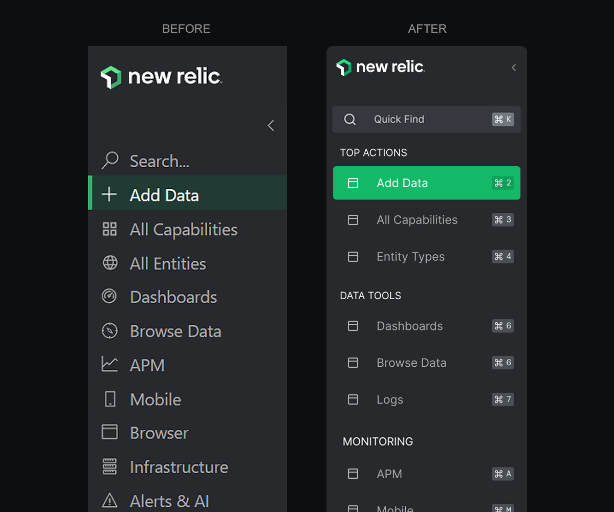
Left-side navigation.
Left-side navigation.
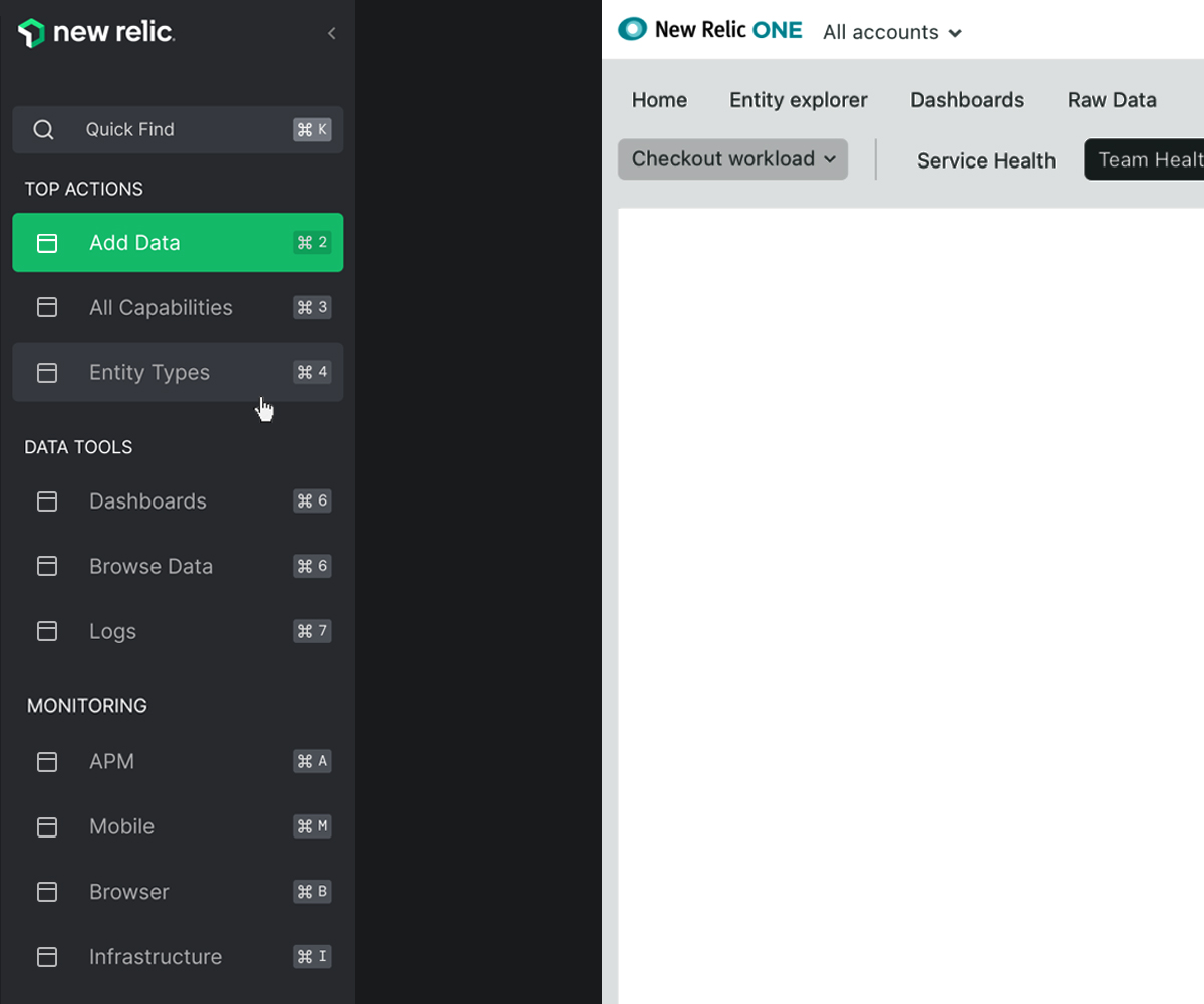
The horizontal navigation bar we were using in New Relic One was a mix of design legacy and technical constraints, and it made for a confusing navigation experience. We were using tiny font sizes and crowded items close together to make the list of categories fit into the limited horizontal space. Switching to left-side vertical navigation was an excellent solution to solve many of the issues we encountered. It's easier to scan, offers room for growth, and people are familiar with it.
Aspects to consider.
Some aspects to consider.
We could consider many aspects to further improve vertical navigation. Here are seven proposals that could contribute to making New Relic One's navigation experience easier to learn and predict.
(1) One.
1.
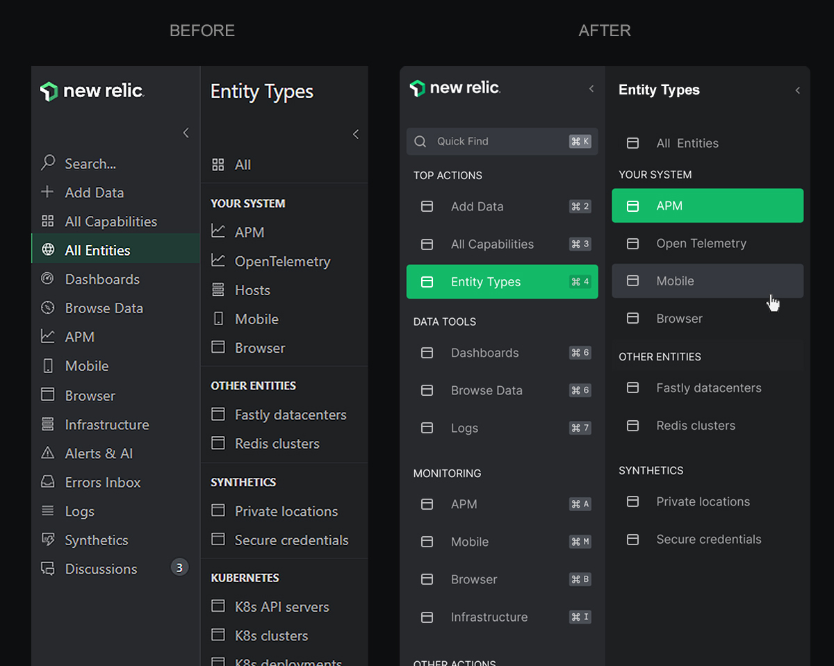
The first-level navigation items are structured in a way that they all appear to be doing the same. If things are close together, we tend to link them as a whole. If there's no substantial difference in how elements in the navigation are treated (visual appearance, proximity, etc.), people will perceive them as the same. Also, we could tell users how to use keyboard shortcuts. For example, showing visual hints of the keys combination next to each element on the interface.
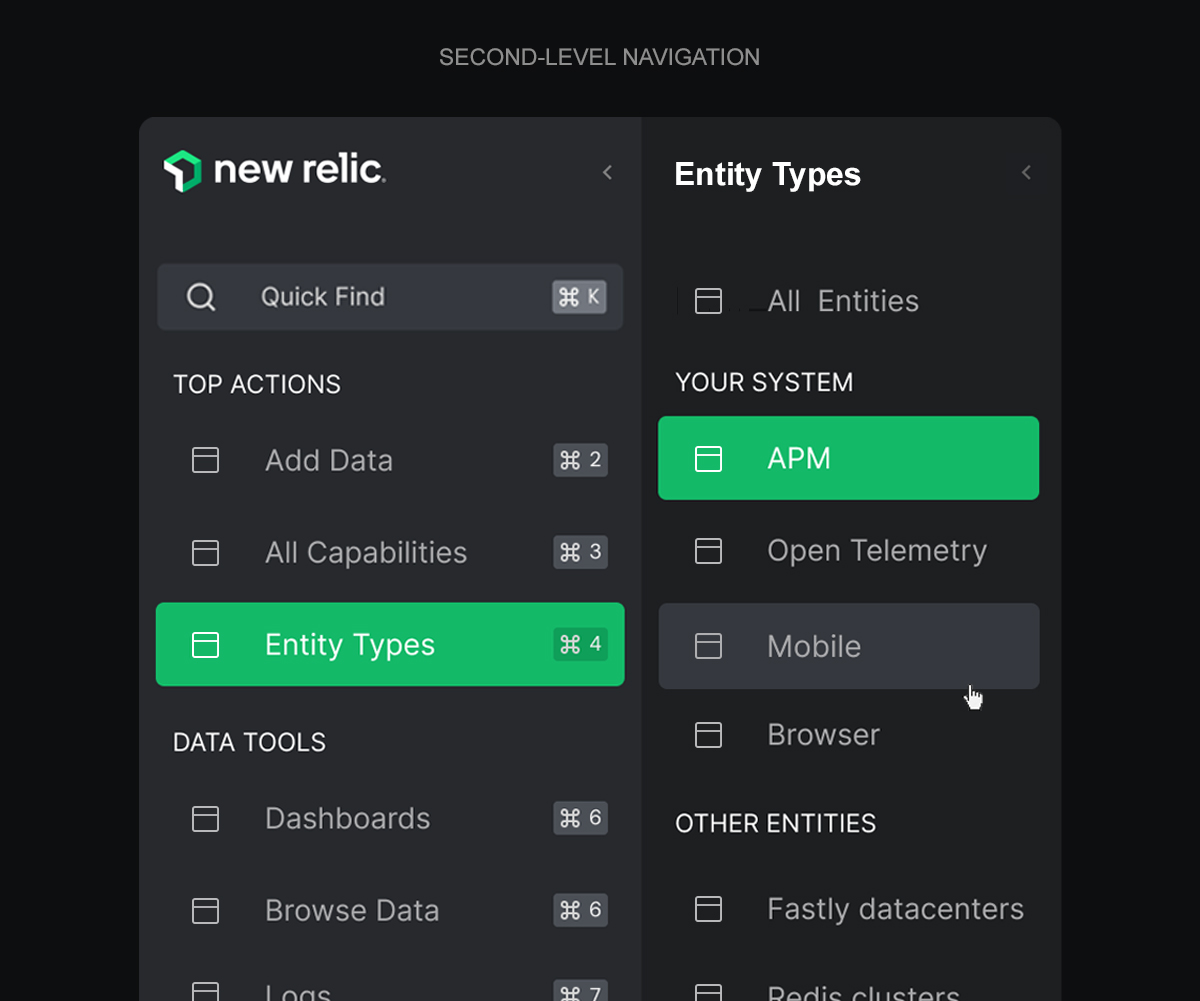
(2) Two.
2.
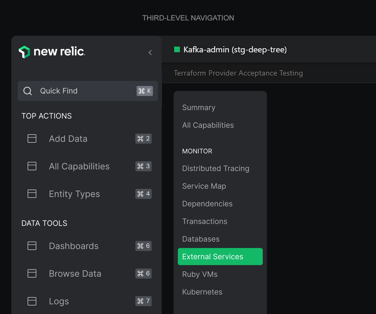
The purpose of second-level navigation is similar to that of entity-specific navigation: to help users navigate through the site. However, they are different in context. Second-level navigation is meant to help users navigate between sections or pages within a section, whereas entity-specific navigation is meant to help users navigate through the content in that specific section. For example, if you select APM in the main navigation and then an item in the table, the navigation shown after that selection is somehow related to APM but not directly related to it. We could consider it a third level.
(3) Three.
3.
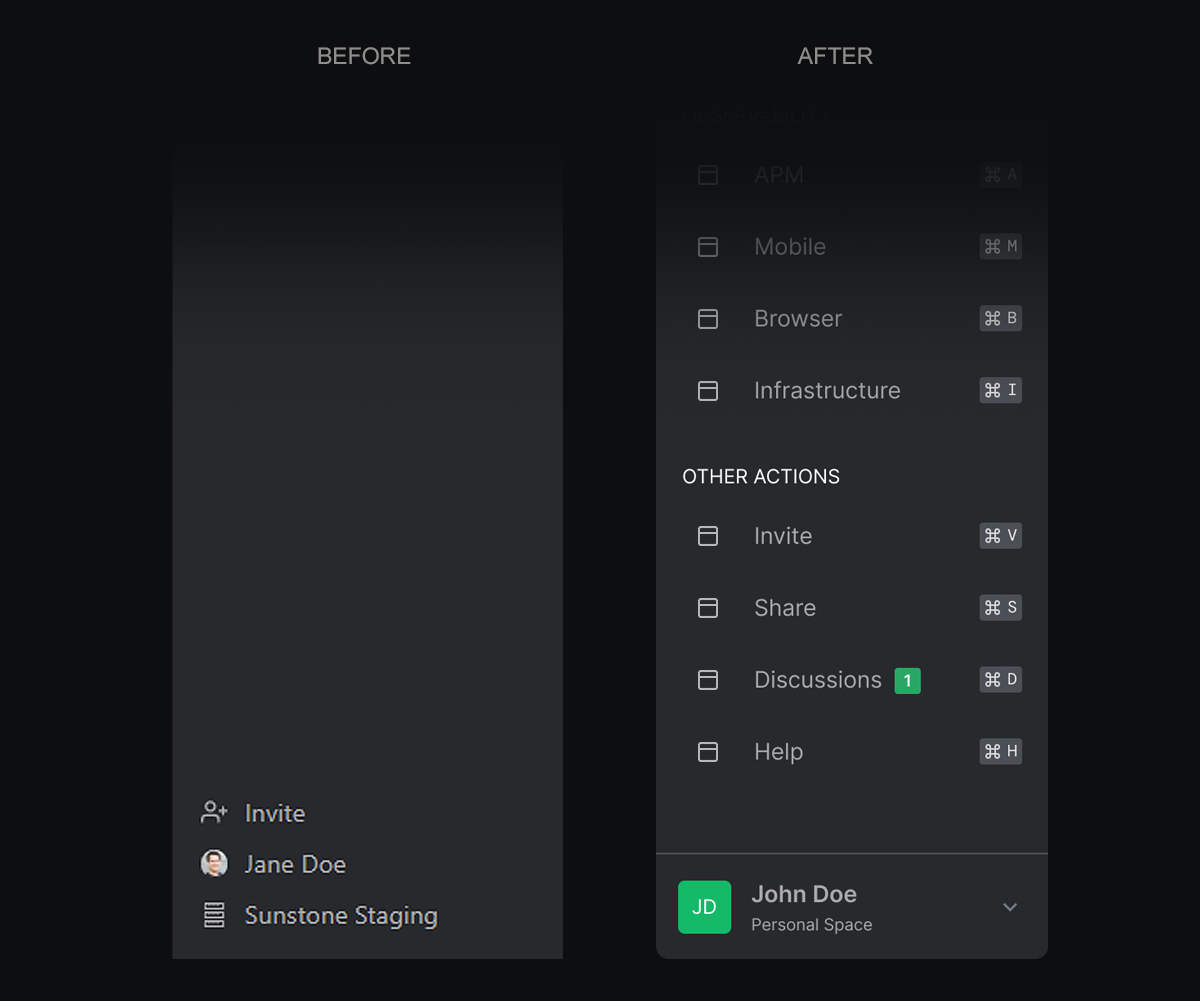
If we apply the beforementioned tweaks, there's no need to use such a big space to separate the menu items that are at the bottom of the left-side vertical navigation (invite, user info, etc.). We could also consider adding the menu items at the top right corner to the main navigation. Scattering navigational items across different parts of the screen may result in creating feature blindness for those who are away from the place where users learn to use to navigate. If you think it's too much content for the navigation, consider adding a "more" item that shows the extra elements.
Lastly, I would consider not making menu items appear and disappear. I don't know if it's a matter of the prototype but makes it more difficult to predict the behavior of the navigation and remember what did you do to make that specific item appear. Also, I would avoid using "mystery actions" than only appear when you're hovering over a specific element.
(4) Four.
4.
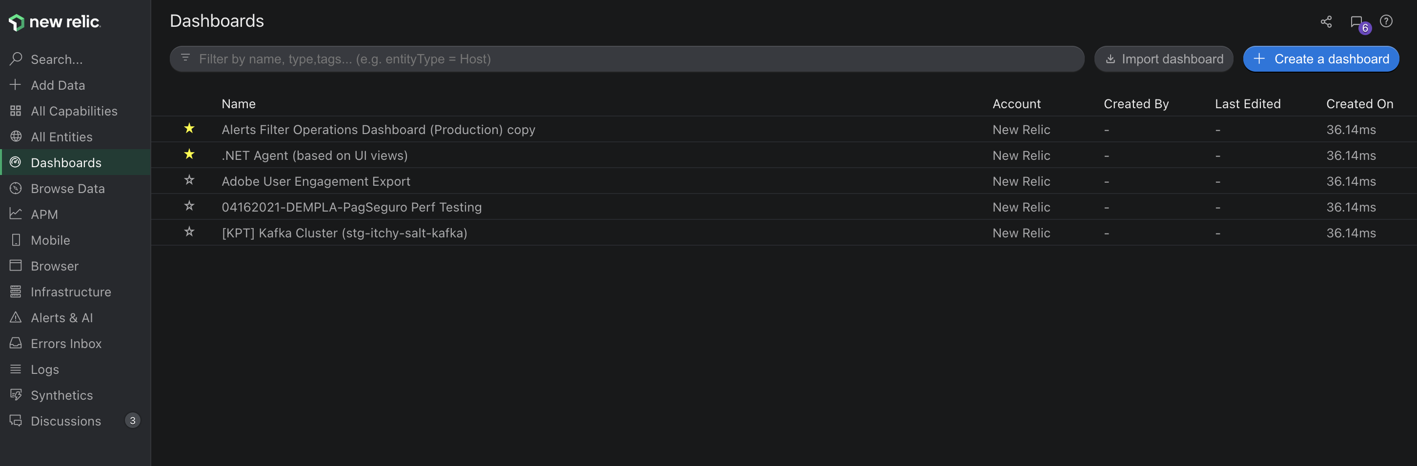
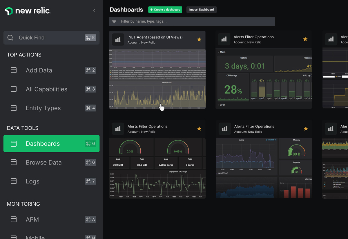
When navigating through items, you're going to reach a table most of the time. And that's fine—it's still data, and it's still useful. This is especially noticeable in dashboards. Right now, we show a table with names and labels—and it's up to you to remember if the name of a dashboard relates to what you were looking for. Wouldn't it be better if we showed visual representations instead? We should strive for consistency, but also consider when it makes sense to break the rule to show more meaningful information on the screen without the need of navigating further down the line.
(5) Five.
5.
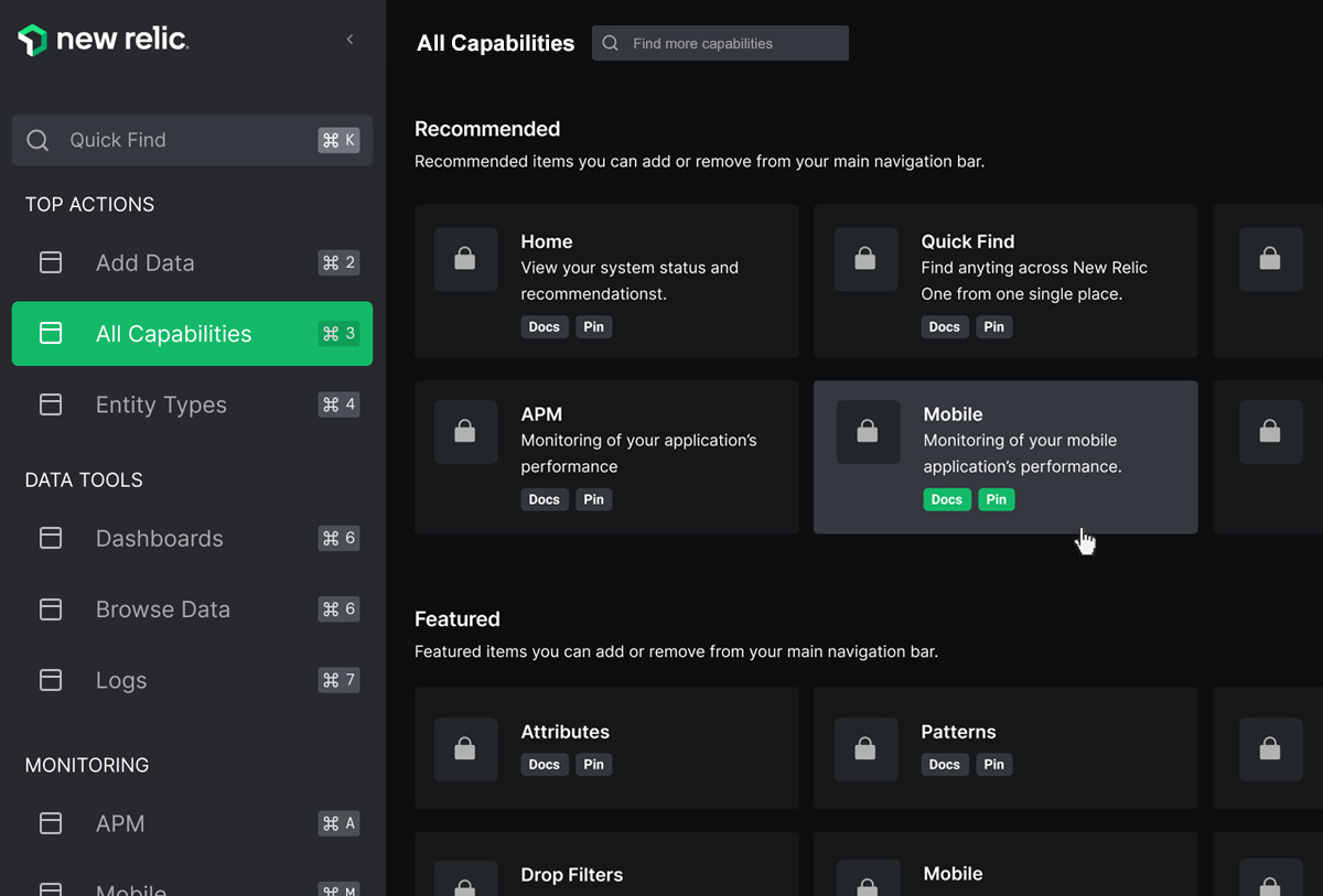
Some layouts would benefit from better visual differentiation of items you can interact with. For example, in the "add data" and "all capabilities" sections. We may be cluttering the screen with so many shapes, so an alternative could be to space elements better to create the visual aspect of a card without using any shapes. Also, we could use a different state on hover to increase affordance. We could also clarify secondary actions (docs, pin, unpin) using buttons instead of links. I tried to completely get rid of the cards, but the information tends to float over a huge dark space (Gestalt principles apply here). I used a more subtle look for cards, but I'd need some more time to play around with spacings to eventually get rid of the containers.
(6) Six.
6.
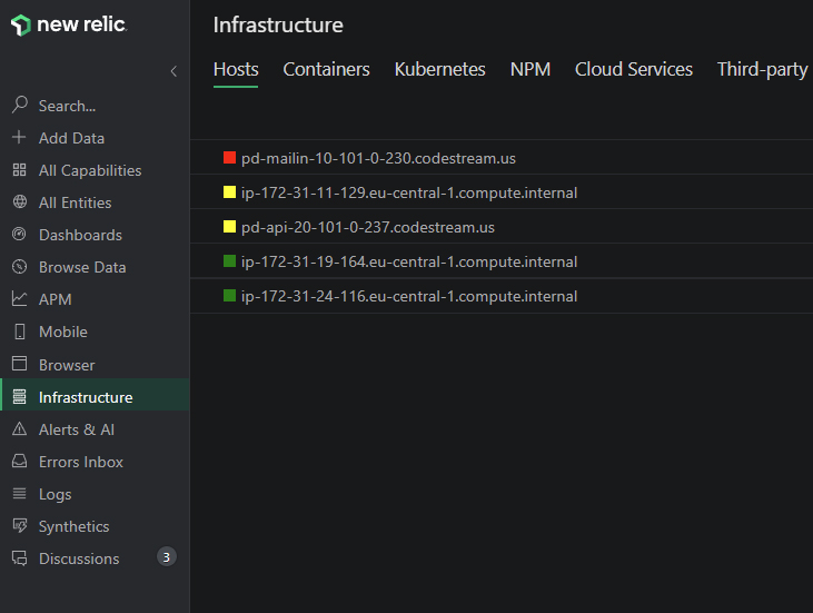
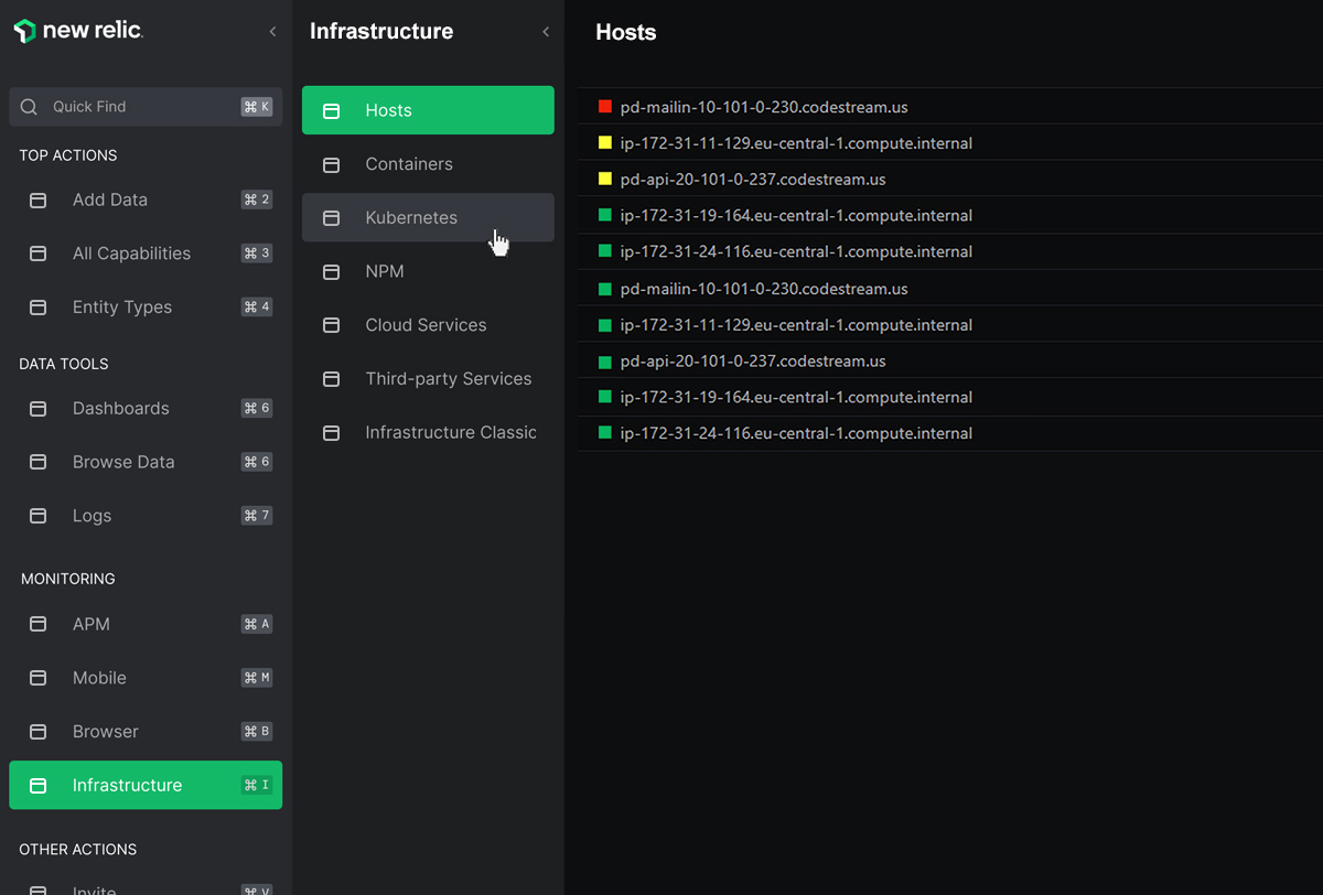
Avoid mixing vertical and horizontal navigation. If we aim to create a sense of familiarity with the product, we should not change the navigation model depending on the number of navigation items one specific section may have. Each vertical content block on the screen is titled based on what that area contains. Reading the headings from left to right creates a natural-looking breadcrumb you can use to know where you are and to quickly navigate through it: New Relic > Infrastructure > Hosts.
(7) Seven.
7.
When we align elements in a way that creates a sense of order scanning through content is easier. When things are out of alignment, it can be disorienting and overwhelming. Also, it makes it easier to move the mouse horizontally while navigating between first-level and second-level menu items.
Review more solutions to real-life problems.