Firefox OS
Designing an operating system to bring the web into low-end phones and make them more accessible to everyone.
The challenge.
About Firefox OS.
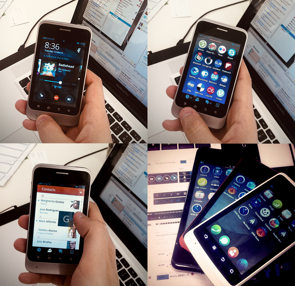
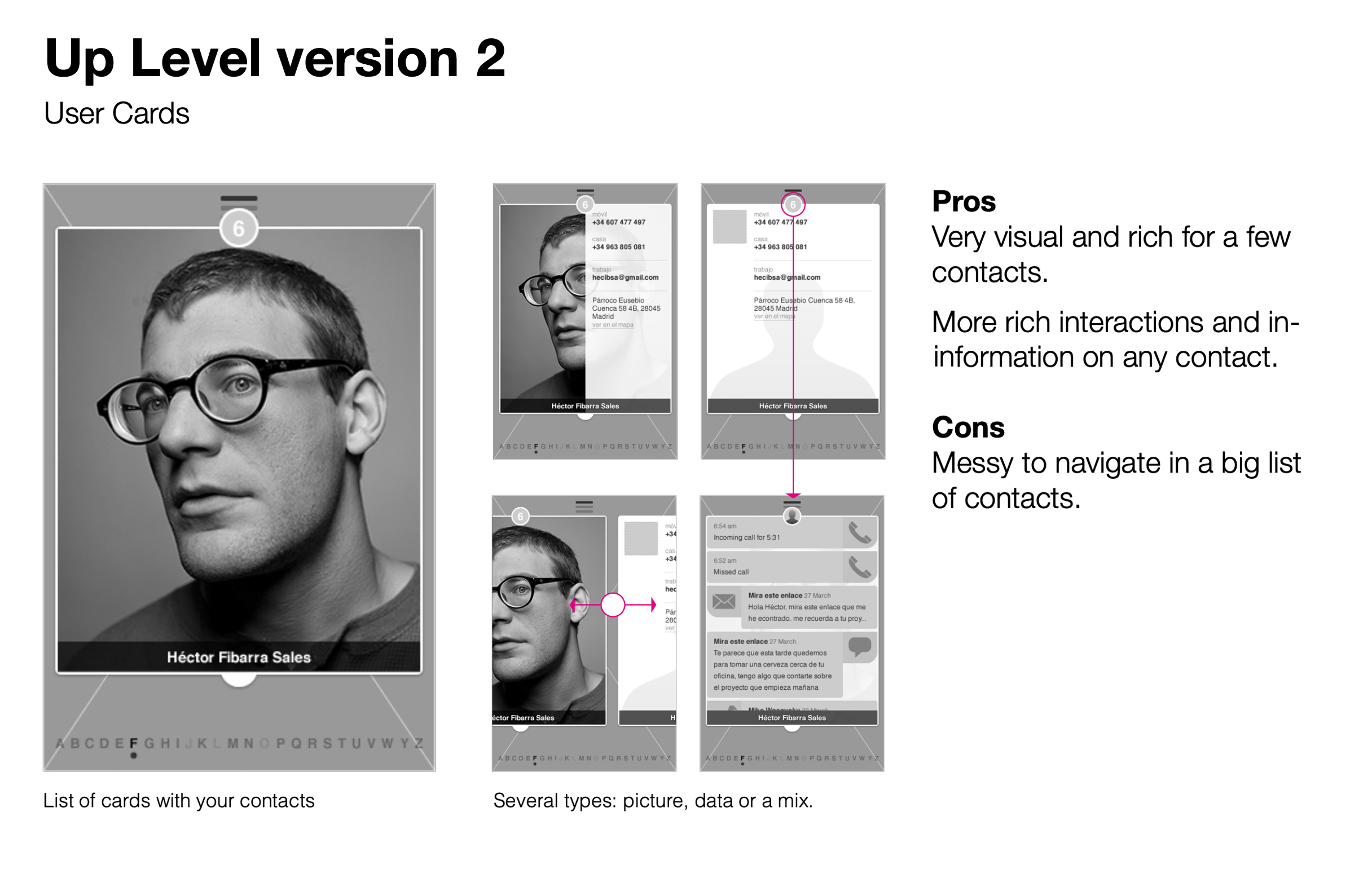
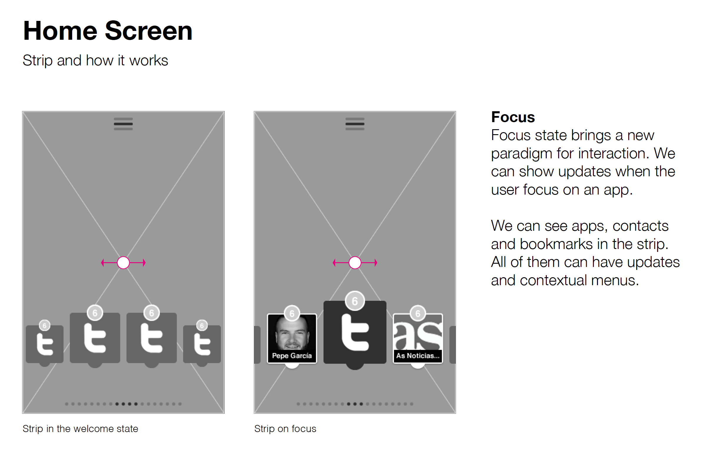
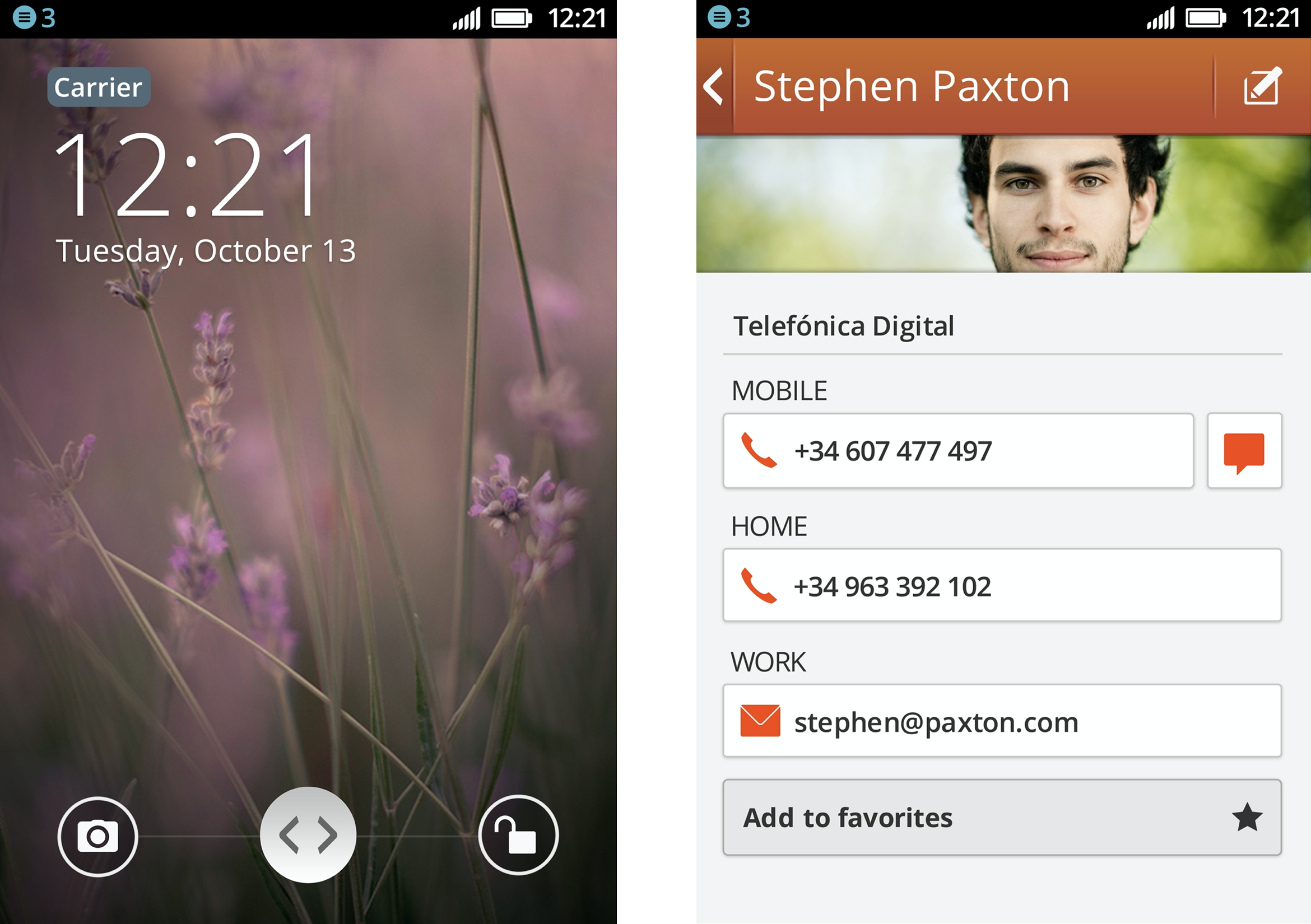
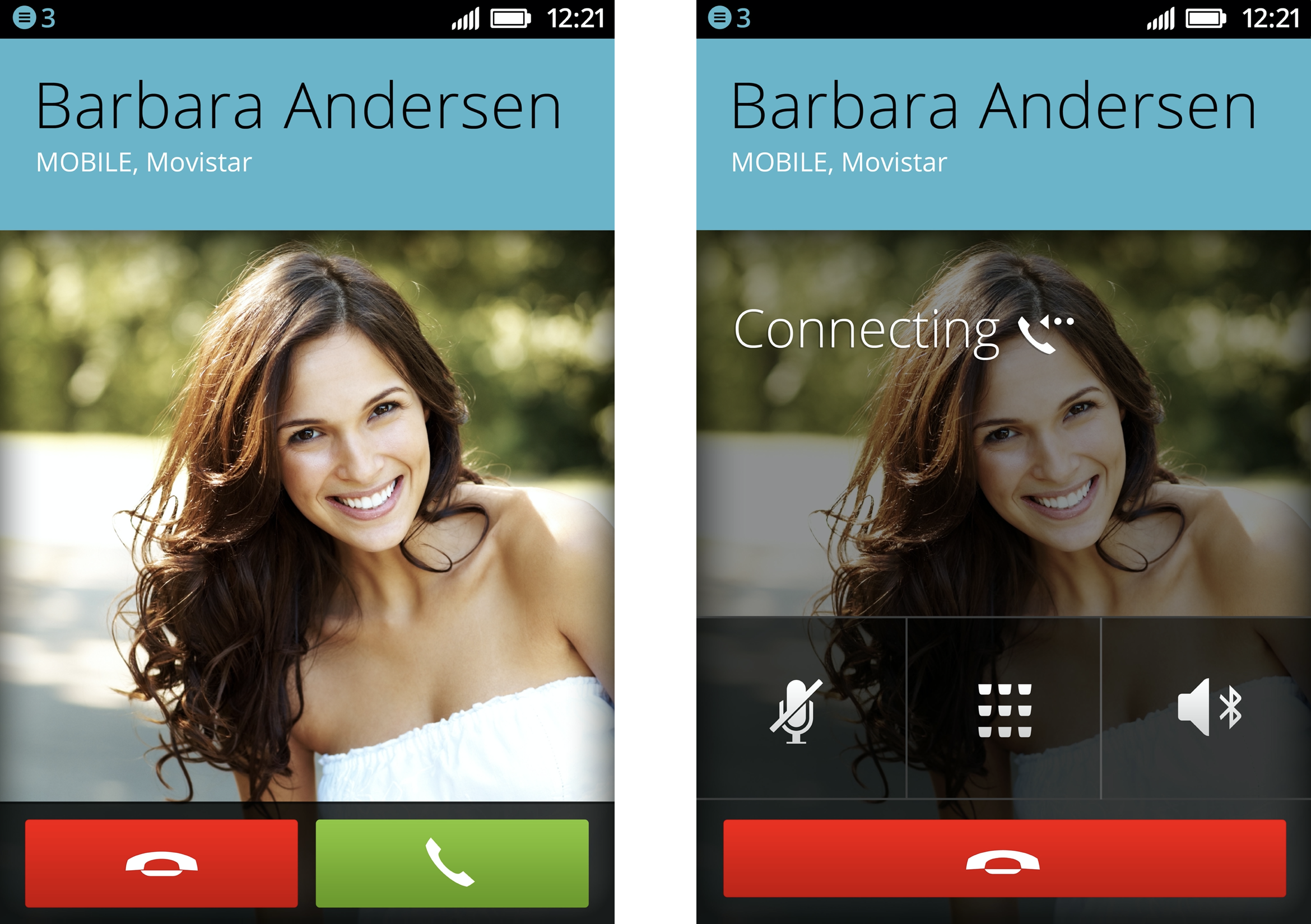
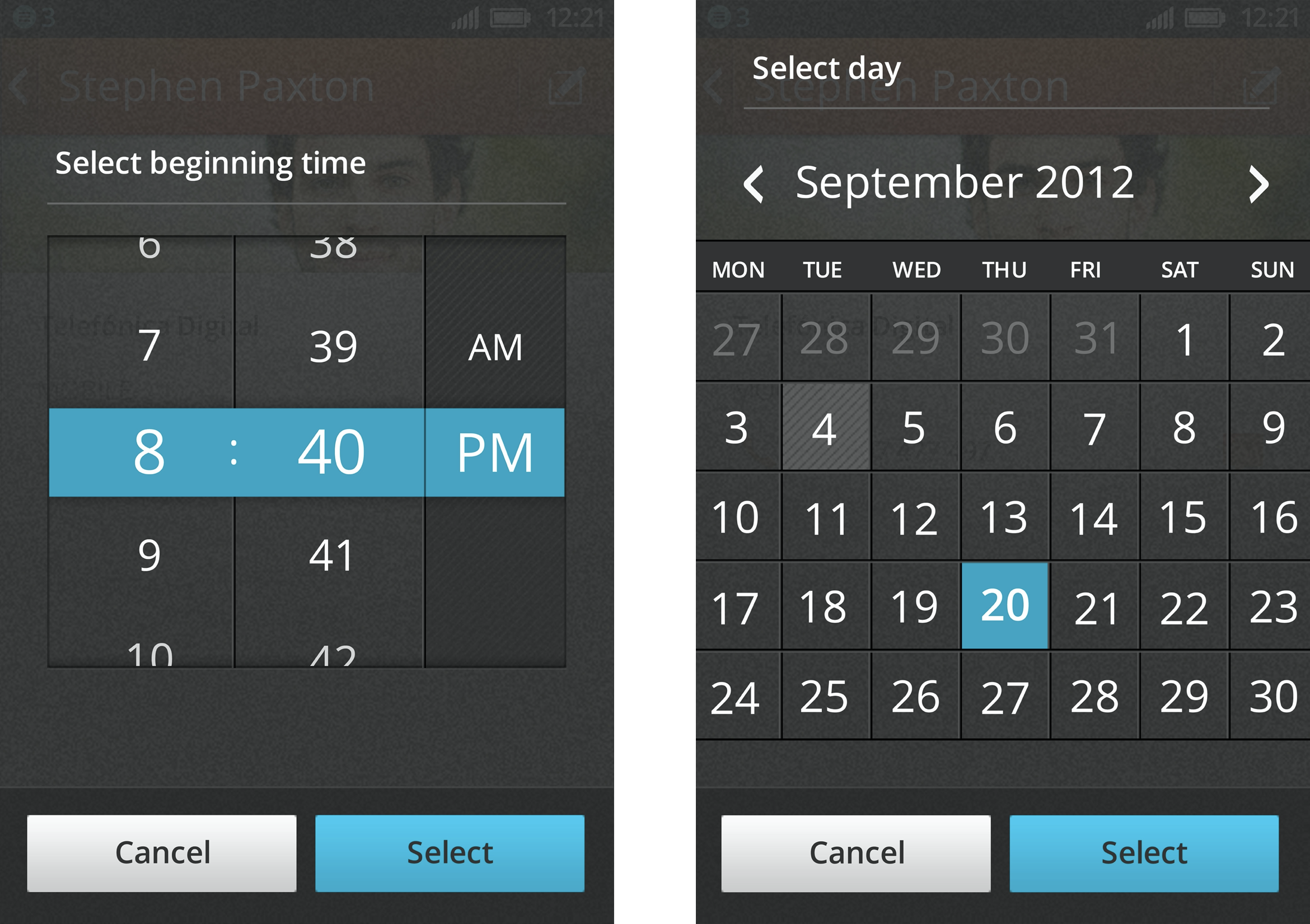
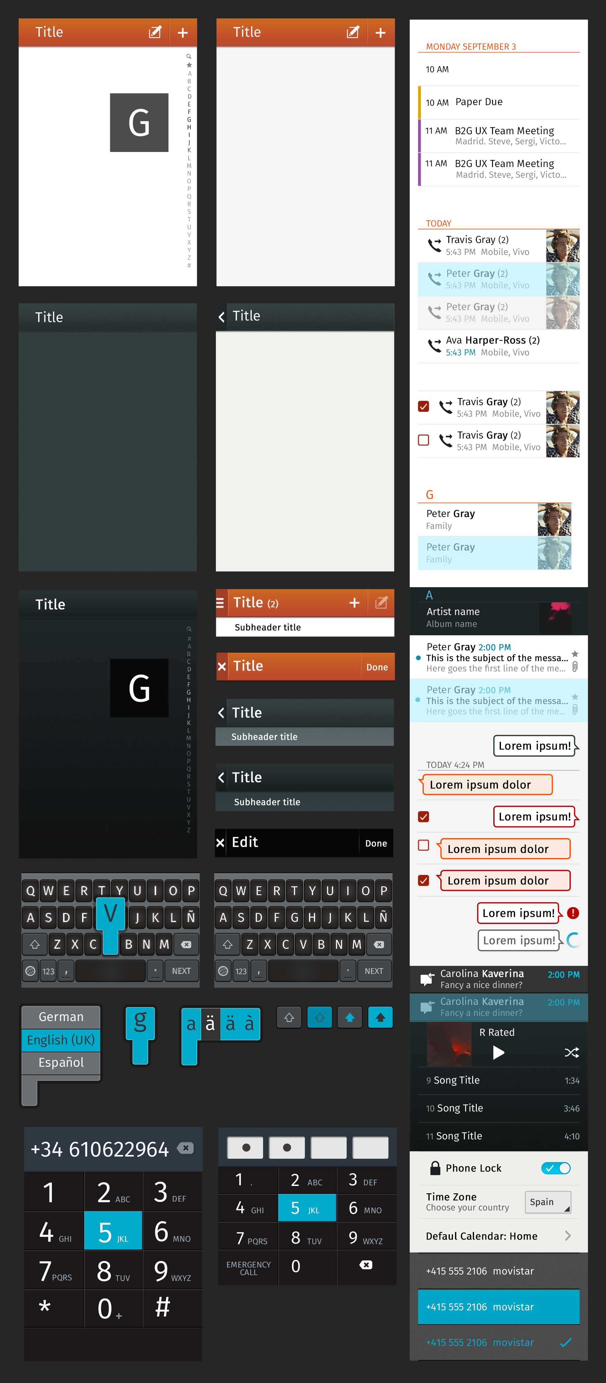
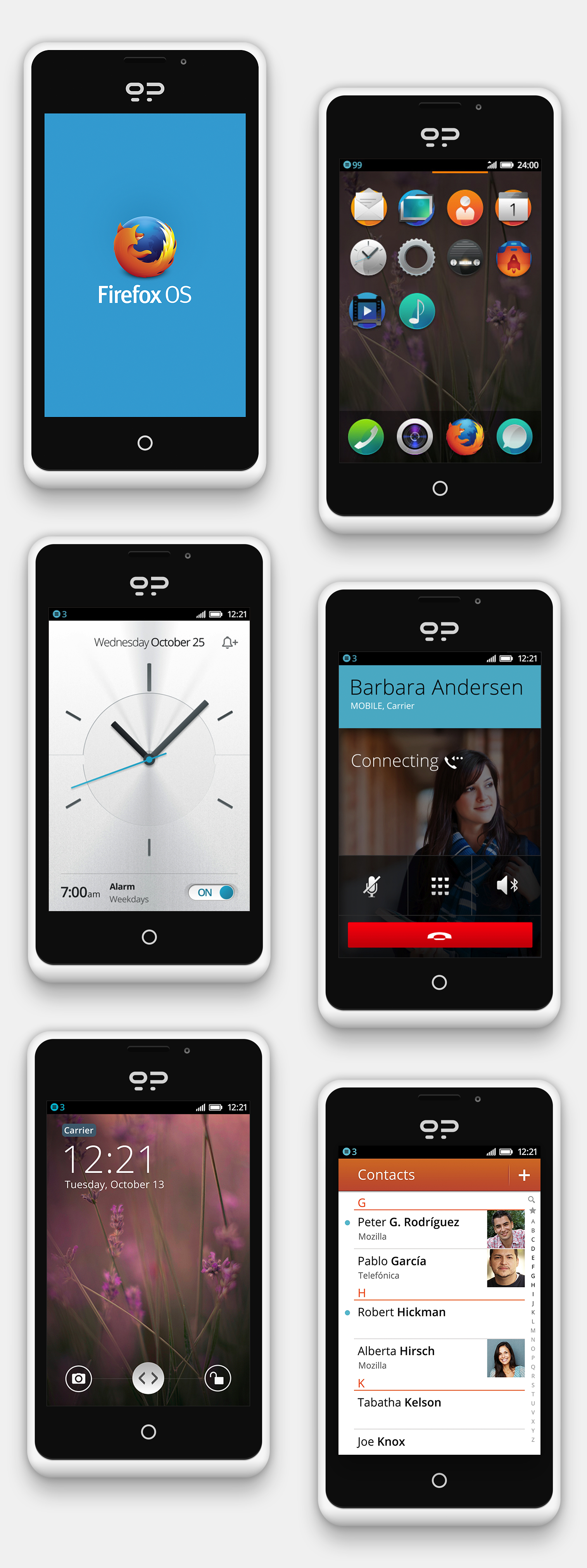
Our goal was to provide an easy-to-use operating system that could be used in low-end phones. I was one of the designers on the team, and my main focus was to craft the product experience for messaging, phone call capabilities, contact management, and the calendar. This included designing the GUI, interaction models, and the UI elements needed to build the apps.
Setting the tone.
The visual language
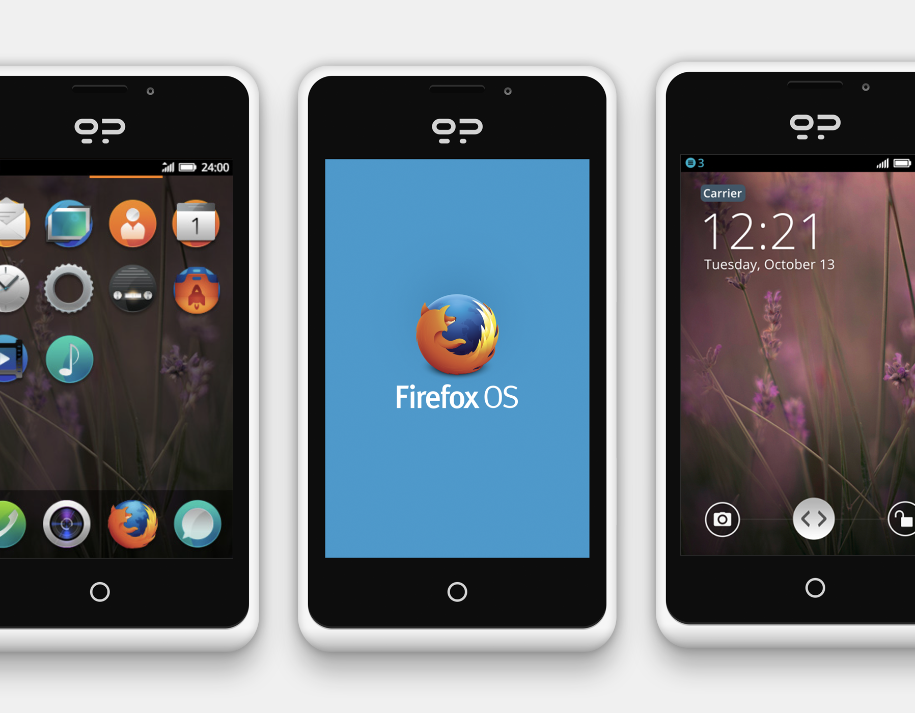
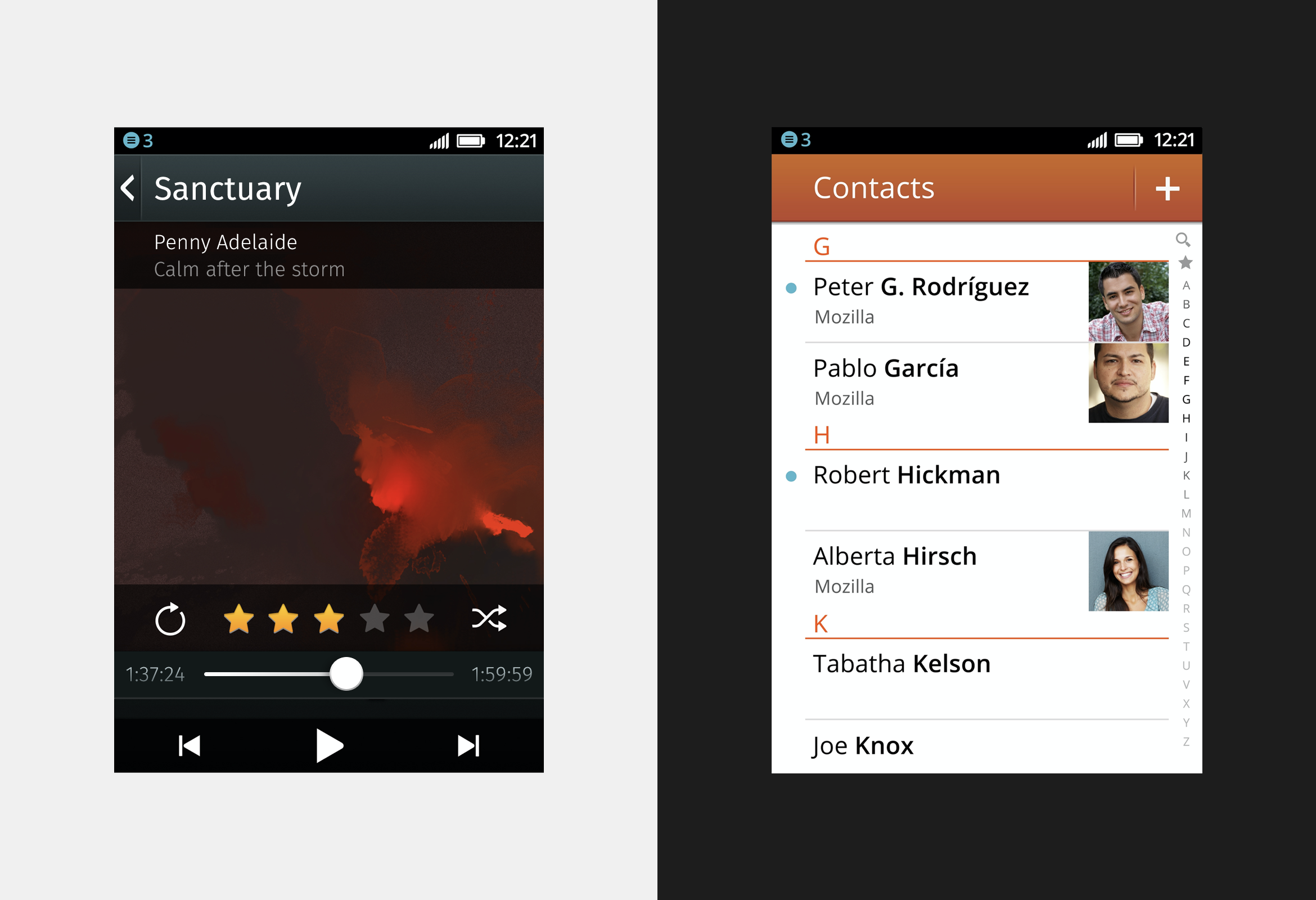
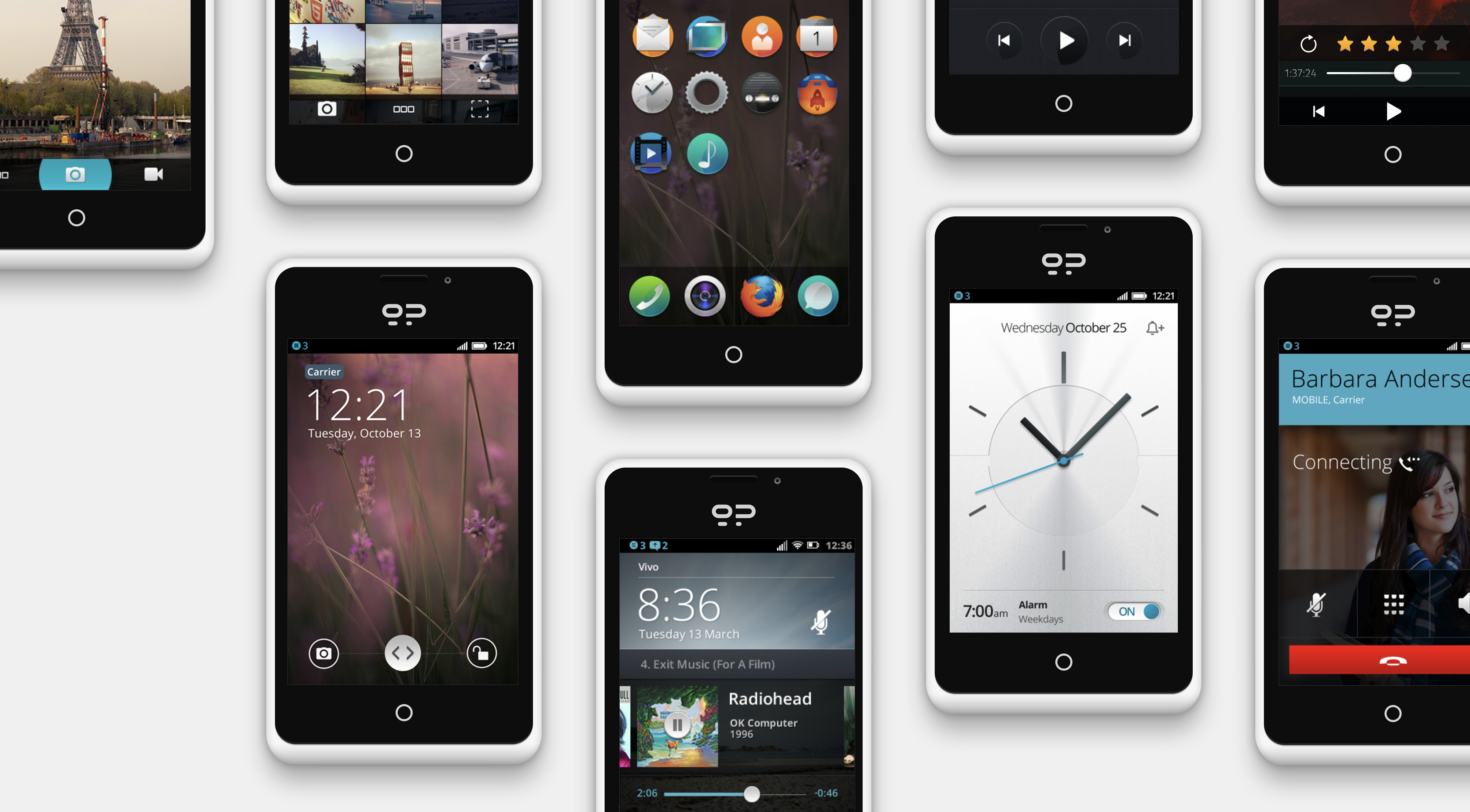
Defining the Firefox OS visual language was critical because the Mozilla brand and the feel of the Firefox browser needed to work together. We wanted the interface to feel light and airy and visually differentiate communication (light) from entertainment (dark) apps.
Final thoughts.
If I had to pick what I'm most proud of in this gigantic effort, it would be the Firefox OS UI kit. The Building Blocks approach did a lot of things for us, but most importantly it prevented us from starting from scratch every time we needed to create something new. The components were easy to replace with real content, and by using the same UI consistently, we managed to deliver a product that felt like one single, cohesive experience.
Check my contributions to the Firefox OS UI in Mozilla's Wiki →
Review more solutions to real-life problems.

