Docplanner
Scaling Docplanner's design team while leading the effort of delivering a healthcare experience that prioritizes ease of use.
The challenge.
Docplanner needed to increase the design's team size but their structure and way of working prevented them from functioning effectively at scale. I joined as a Design Director with the objective of growing the team and increasing the adherence to our design principles, guidelines, and tools.
The foundations.
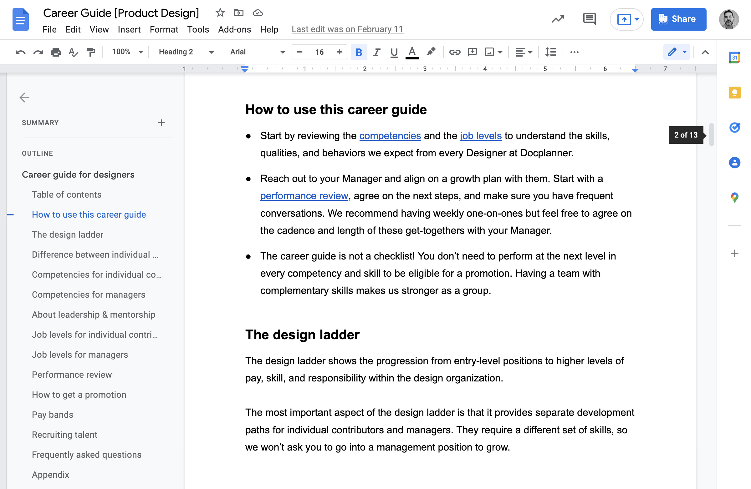
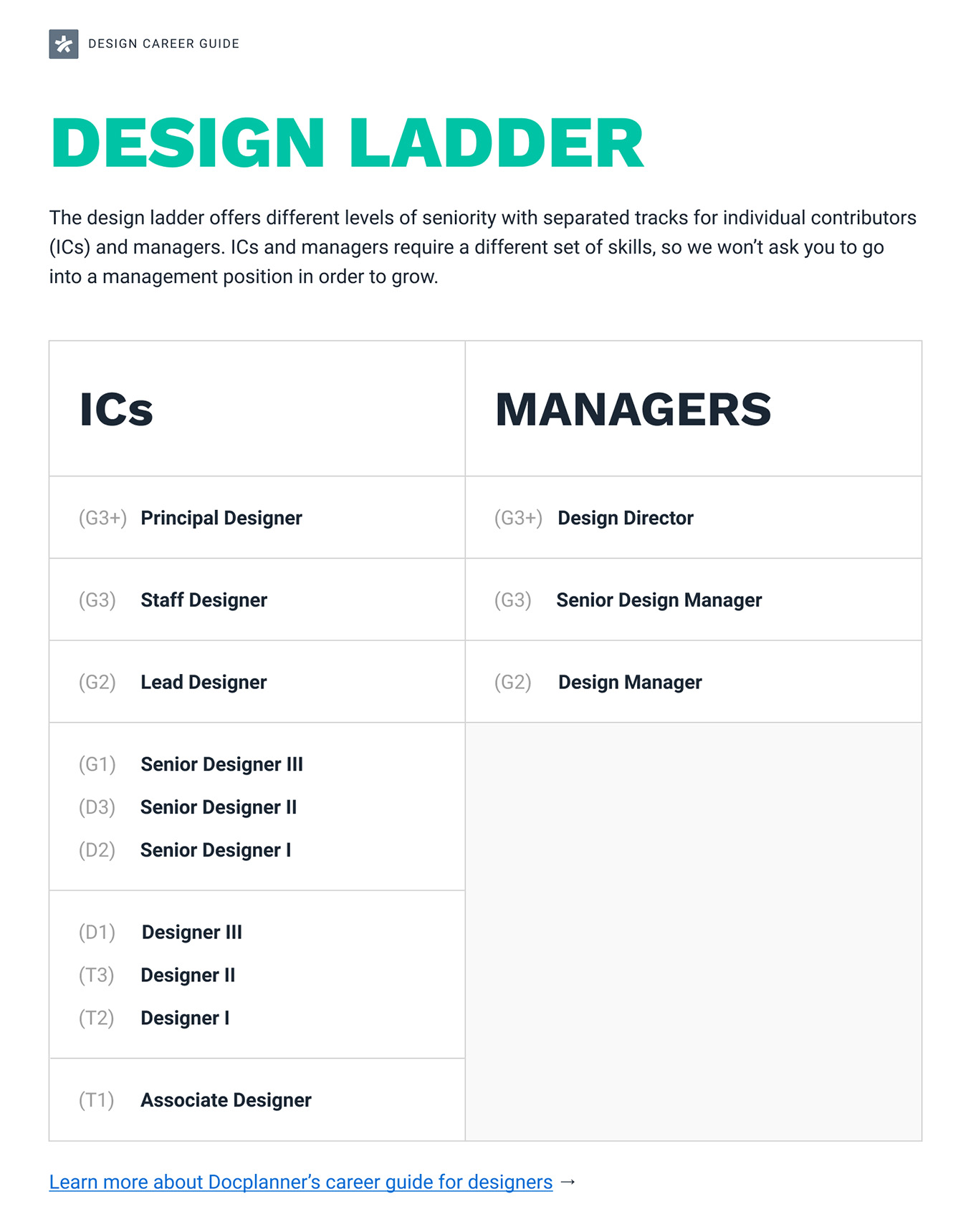
We removed the Team Lead role, separated individual contributors and managers into different tracks, and consolidated growth opportunities and pay bands for product, content, and brand designers. As a result, we delivered a new career guide that managers could use to level new hires, assess which skills we were missing, and help designers plan their careers.
The structure.
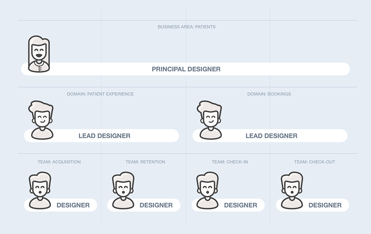
Designers were embedded in product teams without a hierarchical relationship. It was working, so we kept it. On top of it, we set up a hierarchy of roles with lead designers working across product teams and managers supporting and providing guidance to all of them. This helped keep designers engaged as full team members and better align across product teams and business verticals.
The design system.
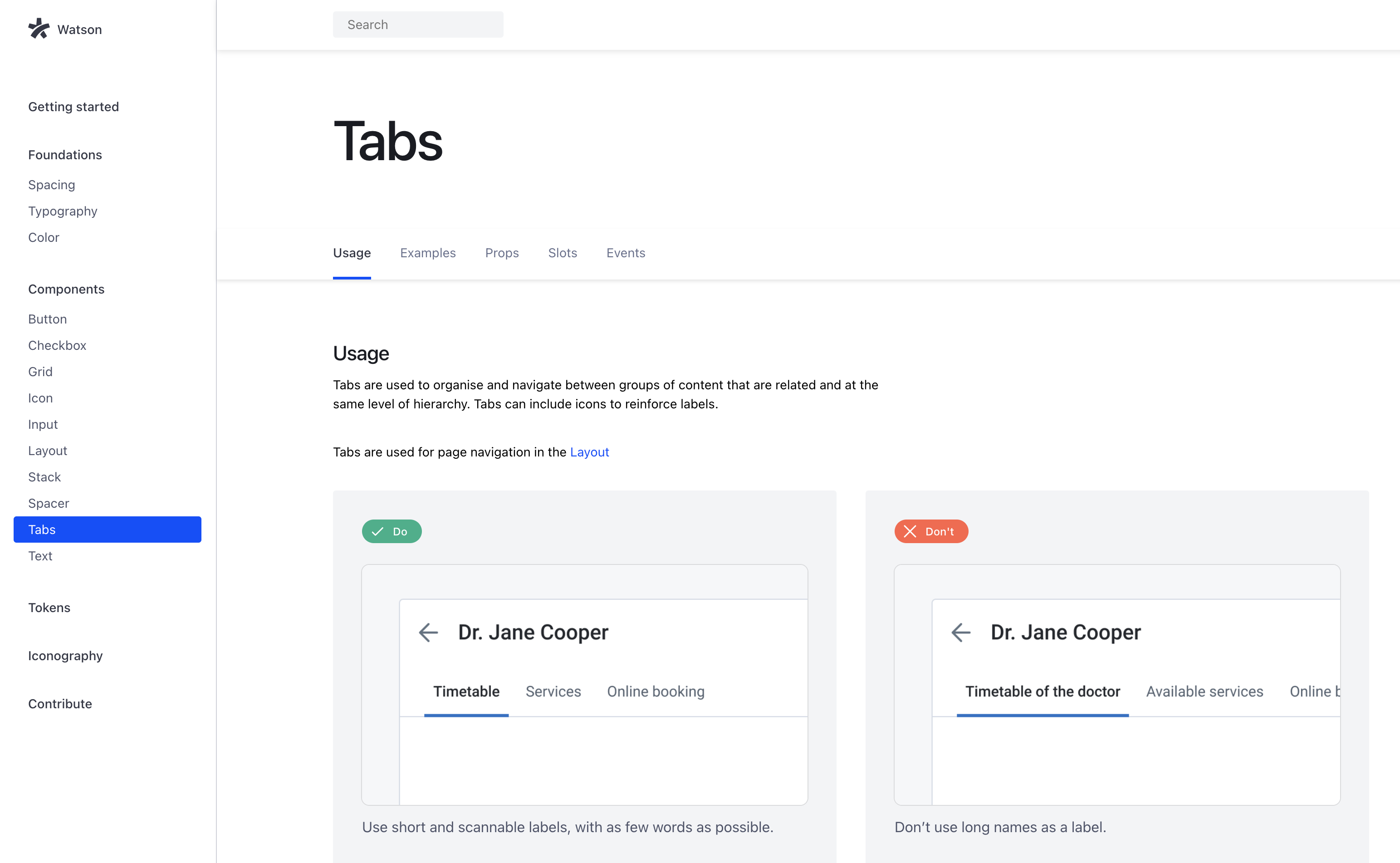
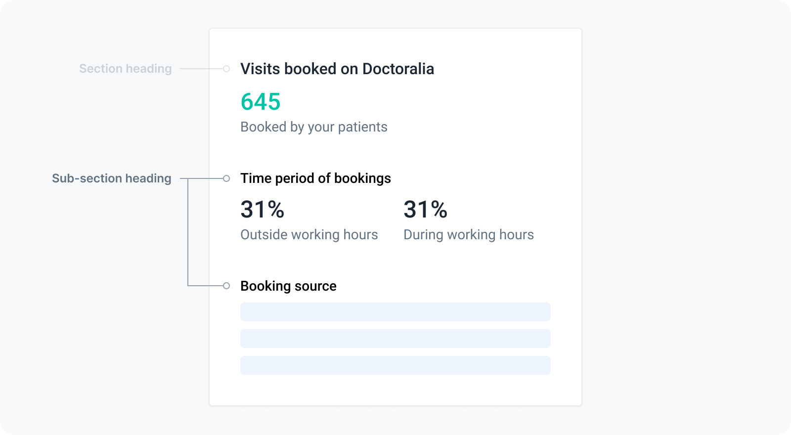
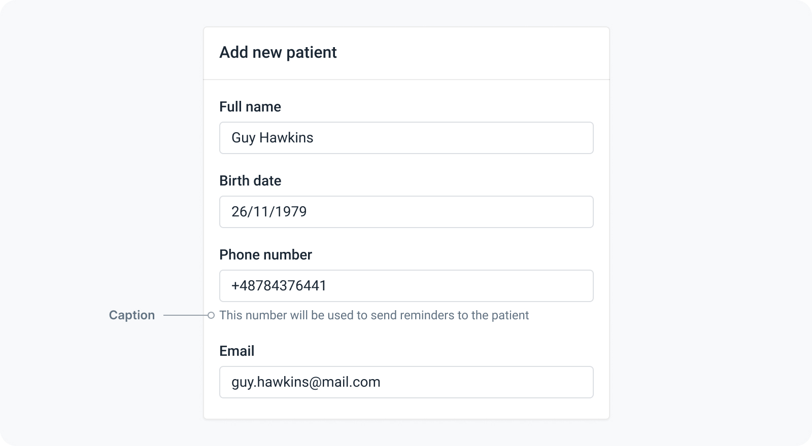
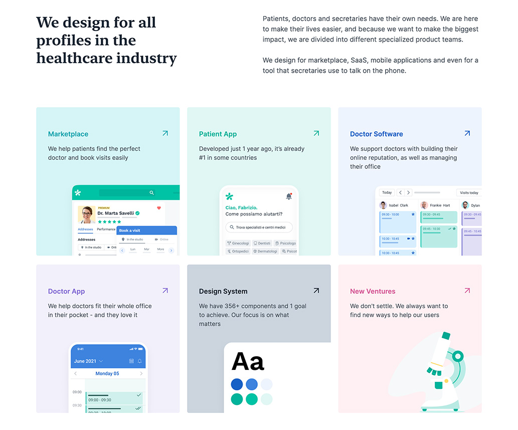
We made it easier for everyone at Docplanner to access our user interface documentation in one place, provided a better structure for projects in Figma, and created the needed processes and help channels to capture bugs, issues, and feature requests through Slack and Github Issues.
The rituals.
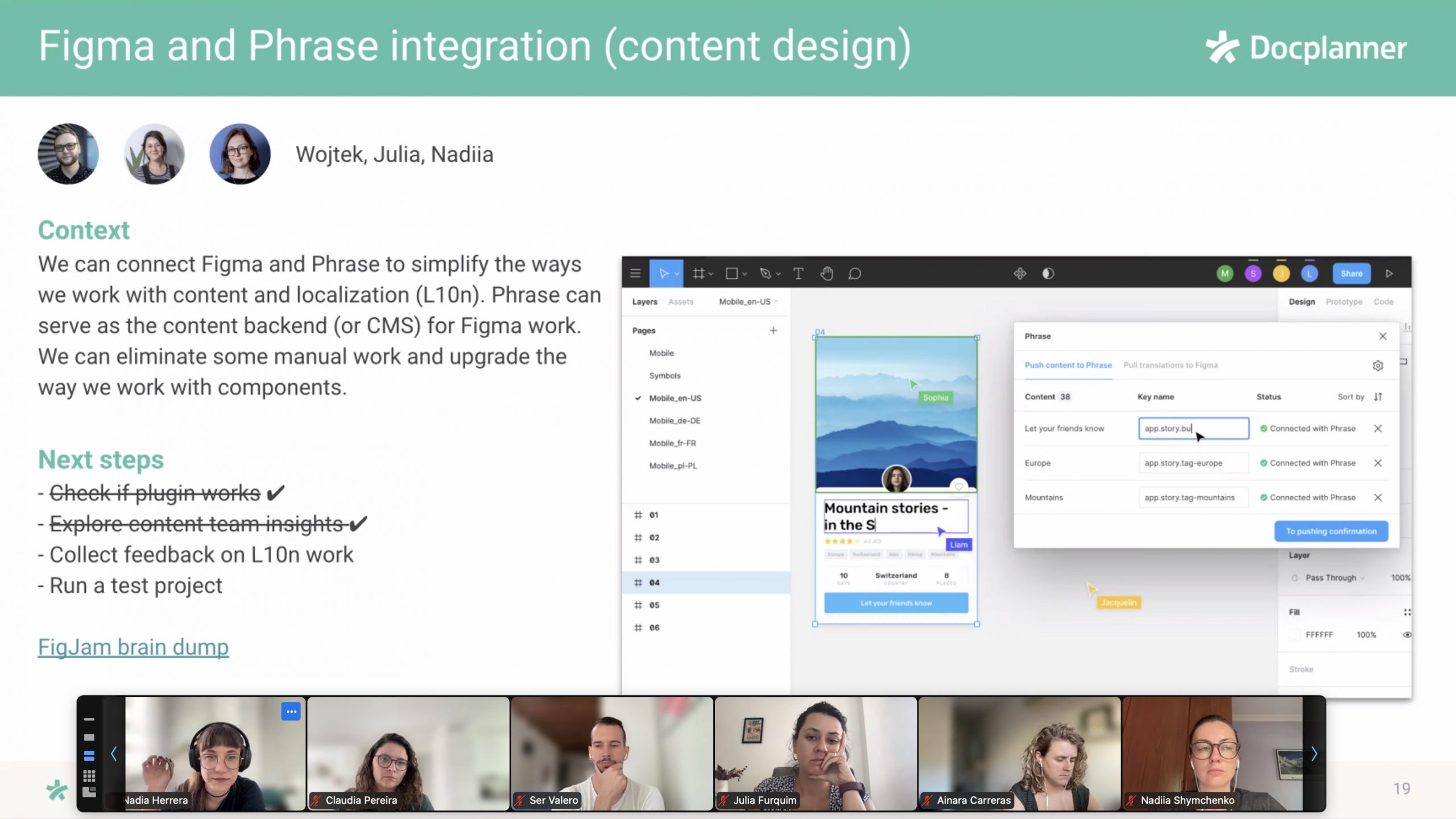
We reshaped all the meetings and defined clearer goals, agendas, and frequency. Having clear rituals helped designers feel encouraged to share their work with their peers, stay informed about business updates, celebrate accomplishments, and build a stronger culture based on a genuine interest in what everyone on the team was working on.
The strategy.
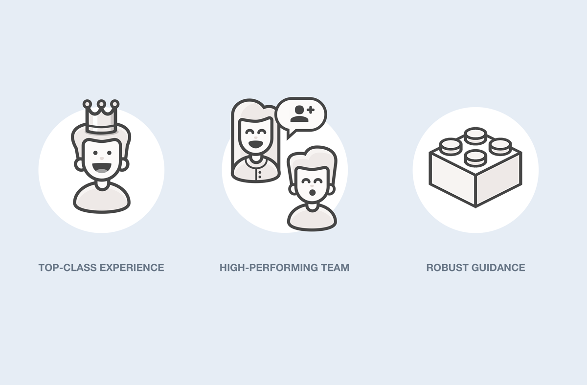
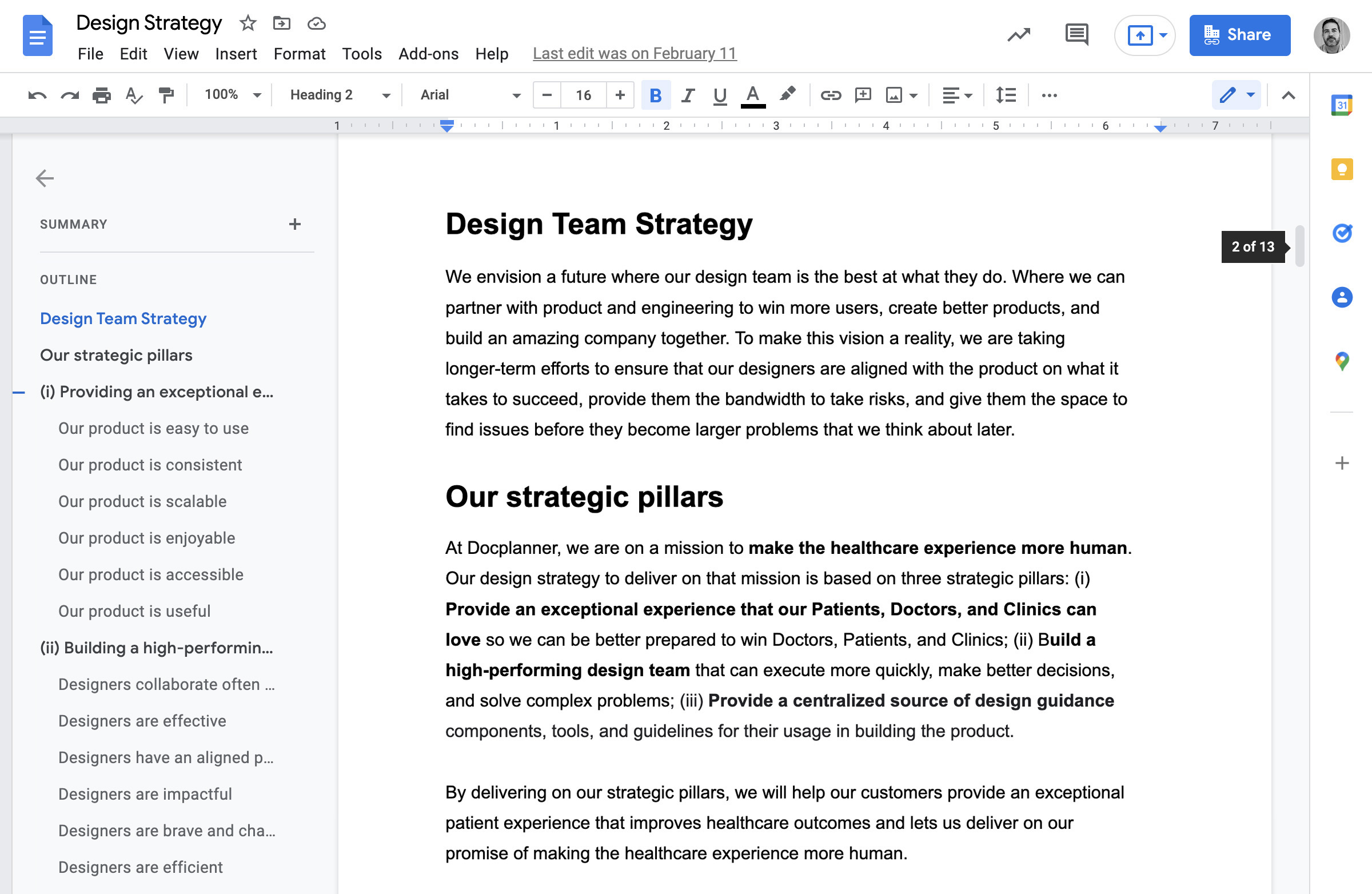
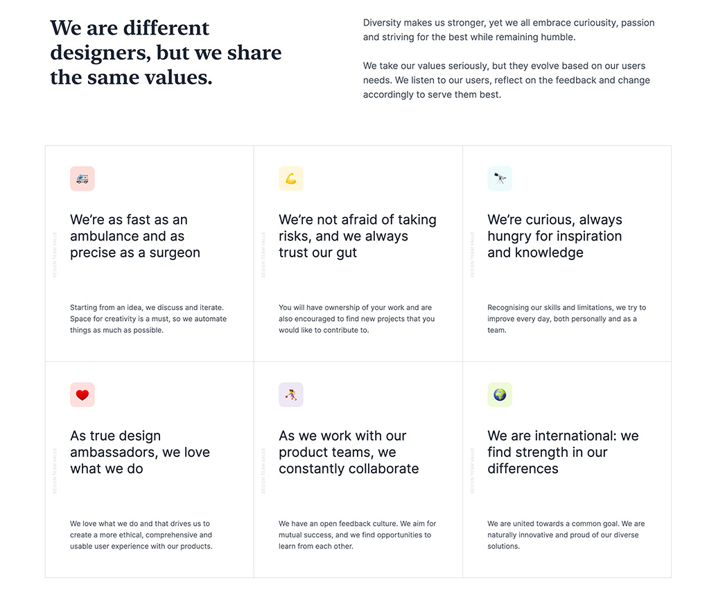
We defined a vision for the team, our three strategic pillars, and a way of measuring our level of accomplishment. From there, we created a standardized approach to setting the design OKRs to increase clarity on what we should do, why we should do it, and how we would know that we were moving in the right direction.
Telling the world.
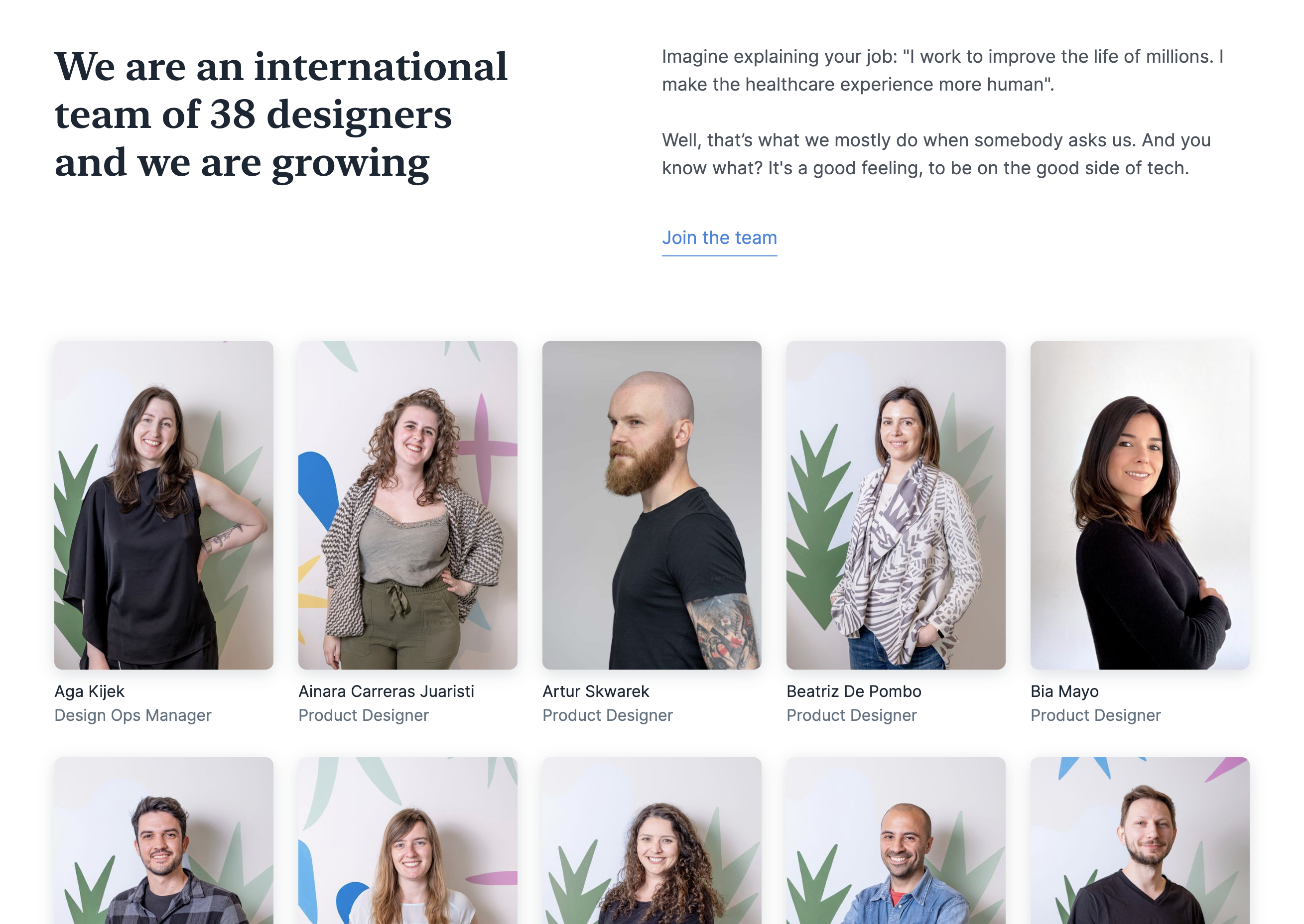
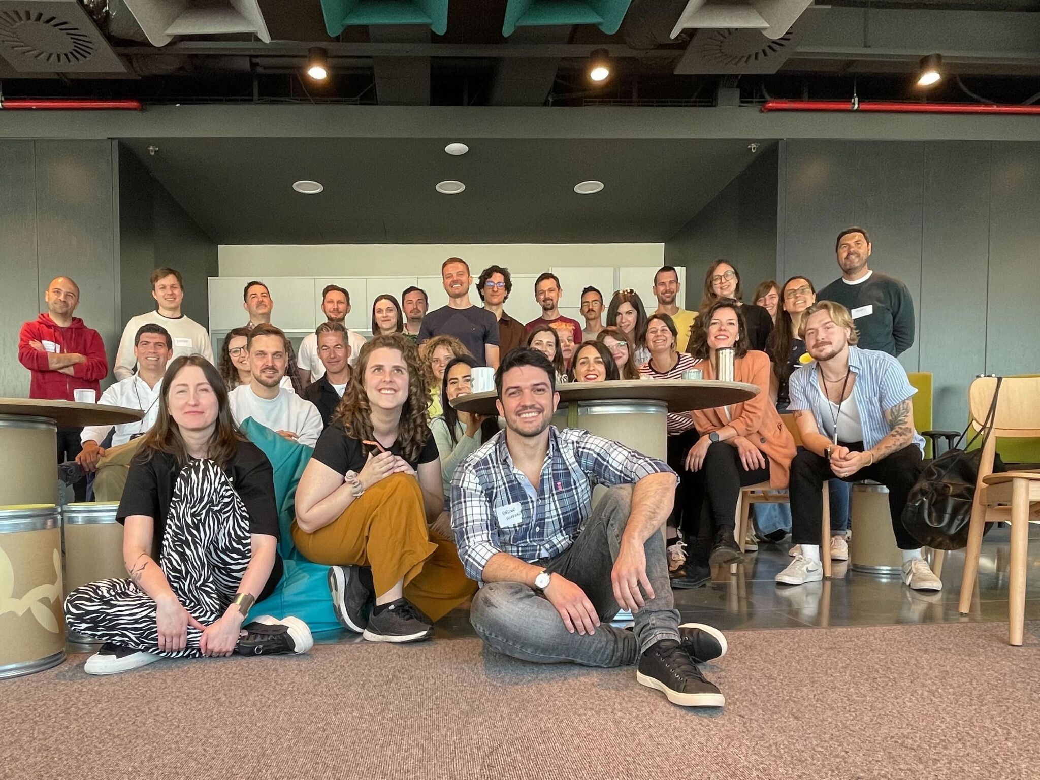
We established different initiatives to show our work, share knowledge, and attract talent. The design team's website is just one example, but we also organized meetups, online gatherings, and internal events where we brought the team together to talk about design and share ideas.
Check Docplanner's design team website →
Final thoughts.
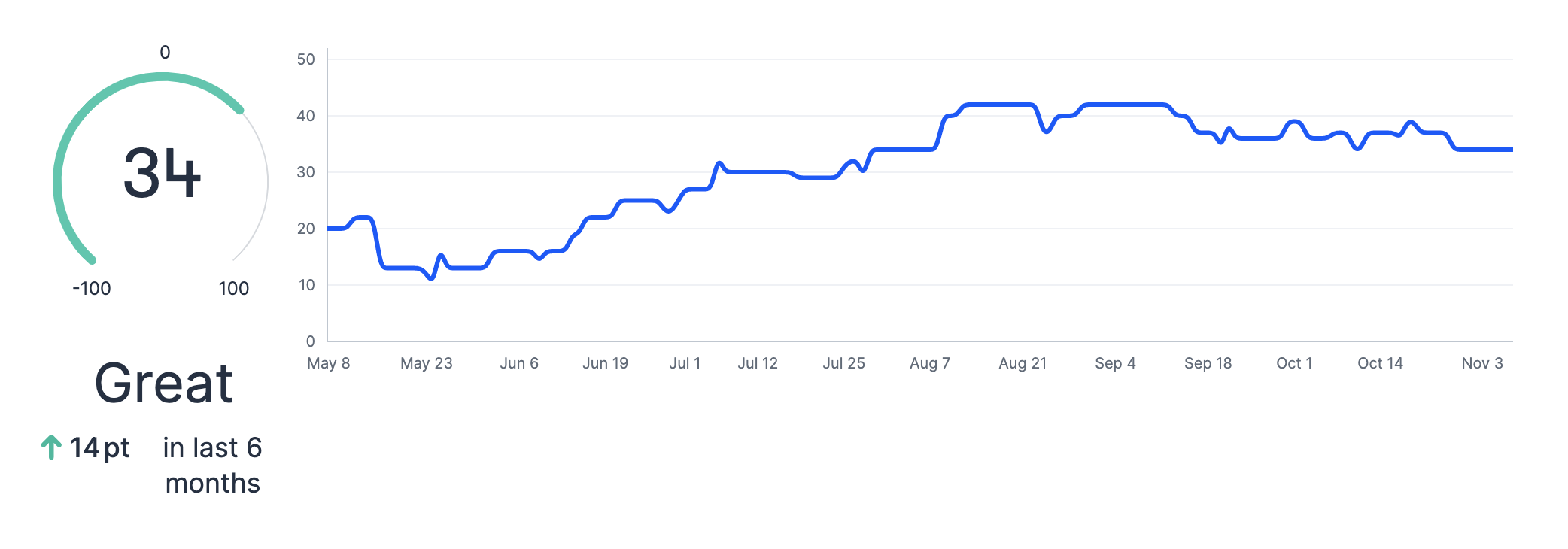
I'm proud to have contributed to building a more effective design team that massively contributed to Docplanner's business growth while delivering a meaningful product to our users. We did it by defining precise role expectations, establishing a shared vision and measurable OKRs, and increasing adherence to our design principles, guidelines, and tools. As a result, we managed to grow the design team by 53% in eight months (more than in the previous 7 years) without harming the team's satisfaction score (NPS +40%) or the quality of design outputs.
Review more solutions to real-life problems.
