Design Exercise (Part I) by Sergio Vila
Explain how to solve a drop in conversion after a sign up redesign.

Designer after receiving the news about the conversion rate drop. (Photo by Gettyimages).
Let's start with a short story
Design is about telling stories, so let me first frame this design challenge by telling you a story. It starts in a tech company, one of those with an open office arrangement. A product owner walks over to a product team, takes a deep breath, and states
Product owner: We have to redesign the signup! Look at Google, Facebook, and all those flashy apps out there that have millions of users. Our signup looks ugly and outdated.
Everyone nods in agreement. They use (and love) most of those flashy apps! So the whole team scrambles and starts working on a new signup. There’s a whole bunch of new functionalities to be designed, they spend months working hard to get everything just right, they launch it, and… BOOM! The new design performs waaaay worse than the previous one.
Product Owner: We have a 50% drop! This is massive. We have a problem. A big problem. A really big, big, big problem.
When something like this happens panic hits, and it hits hard. The product people start talking to each other in disbelief.
Developer 1: But… we did everything right.
Designer 1: But… the new design was way more polished than the old one.
Designer 2: But… <! — place excuse of choice here — >
Eventually, people start to get fired.
Test, test, and test again
The one thing that consistently causes drastic drops in conversion is a lack of testing. A lot of elements are updated in a new design: new functionalities, new flows, new copy, new visuals. But massive redesigns are generally not well received by users. Actually, they tend to hate them. If you launched the new signup to 100% of your user base without properly testing it, you may end up not only having one problem but two: the drop in conversions and not knowing what caused it.
Don't do the obvious
The first reaction when a problem like this hits you is to roll back to the previous version. The temptation to go back to the solution that worked before the redesign can be very high, but in the long run, it’s worse to do that. Rolling back is not always as easy as it sounds (technically speaking), it will confuse users, and most likely it won’t solve the problem.
Yes, but...
Right know you’re thinking: Ok, I got your point but the problem is still there. Yes, I should have tested the sign up before launching it. I didn’t. Blame it on me. But the reality is we have a super-duper new signup that is making us lose users (and money). We need a plan to fix it now!
Ok, ok, here are some ideas that you could try to help you fix the conversion drop problem:
1. Test the task completion success rate:
Consistency in design is not as important for users as completing the task. You need to understand where your users are dropping off to know what should be fixed. Data scientists and BPMs are your best friends here. You can also use tools like Google Analytics or Crazyegg, or the fantastic Lookback to do live interactive testing.
What if users just closed the app without interacting with it at all? You won’t be able to understand these small nuances just by looking at the numbers. You need to get some qualitative feedback as well. You can do that by observing how users interact with the product. Bring some users to the office (they don’t bite). DON’T over-explain, just ask them to perform specific tasks while you take notes.
Believe it or not, if 5 out of 5 users can’t find the sign-up button, that’s a problem you have to fix. You don’t need to test with 2,000 users. You don’t need to have “statistical significance” to see you have a problem there. If sharing a common space with other humans is not your thing, you can also use session recording tools like Inspectlet.
Take all the problems you have identified, prioritize, and follow an A/B testing approach to fix them. From there, continue testing, measuring, and optimizing.
2. Test the content:
This one may seem obvious, but even a product with well-written content and nice graphics can have a drop in conversion rate. Just because it’s good doesn’t mean it’s what people are expecting. Again, talk to your users and compare your new design with the old one. You will discover what they understood in the previous design that they’re not understanding in the new one.
3. Understand your users:
Yes, you should definitely have done this before spending 6 months working on a new design that is not working, but it’s never late to do things right. At the end of the day if you want your product to be successful you have to design it thinking about who will be using it. Not all your users have the same needs, behave in the same way or have the same motivation to do a specific task.
A good way to know who you’re designing for is to create Personas. Yes, that thing everyone talks about but no one actually uses. Keep in mind that Personas are not just fake props based on fictional characters, you should build them by collecting real information from your users, even from pre-existing knowledge in the organization. In any case, avoid building them based on assumptions or personal feelings. If you hear someone saying: “If I were a user I wouldn’t do that”, run away and set fire to that meeting room.
Final thoughts
Avoid massive redesigns and embrace subtle evolution (as Jared Spool would say). When you get a better understanding of who your users are, what are their needs, what they love, what they hate, and what specific problems they have; you’ll be a bit closer to delivering them a good experience. By constantly testing and iterating you’ll avoid pissing off your users and not having 50% drops… and the best thing is, no one will get fired.
Design Exercise (Part II) by Sergio Vila
Structure the navigation and explain how users could visualize data in a new analytics tool .
The objective for this exercise is to take a look to how I would propose a navigation model for an analytics tool that shows users information about how are they performing in different social media networks, and providing a way to visualize that data.
Following the lead from the previous exercise, a good way to start with this one would be by doing some research to gather insight into our users, build some Personas with the data we gather, and create scenarios that describe solutions we can build and test.
In this case I’ve followed a slightly different approach: I've done some desk research, a product benchmark, and from that I've made a bunch of assumptions that can be formulated as hypotheses we could test.
First drafts
Column charts, bar graphs, line graphs, dual axis charts, area charts, stacked bar graphs, pie charts, scatter plot charts, bubble charts, waterfall charts, funnel charts, bullet charts, heat maps…. Choosing the wrong visual aid could cause confusion or lead to a wrong data interpretation.
We need to track changes from small to long periods of time. Line graphs would be a good choice because they are great to keep track of progress. Area graphs could be even better as we can use color to emphasize data.
I've started by drawing some sketches to have an idea on how the main user flow could work. Hand-drawn sketches are great to move forward very fast and try completely different layout and content structures.
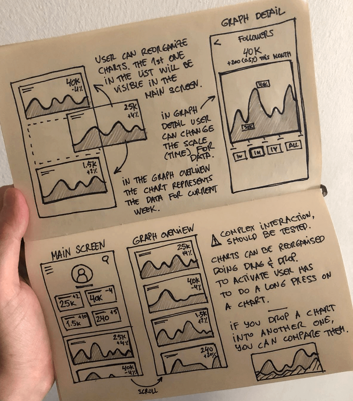
Sketches are useful to start organizing ideas and shape an overview of how everything will work. I usually find it better to write down how things could work than directly jumping to move pixels on any design tool.
Adding more detail
In terms of navigation, two levels would be enough. I've decided to place the key metrics in the main screen. From there, users can get to a detail view and check their progress over time for each metric. To access the detail view, users have to tap on one of the small charts in the main view.
Wireframes are useful to design screen flows, see how the main pieces interact with each other, and even to start taking decissions on the types of content and copy you will be using.
They are also useful to share your design solutions with other team members and gather their feedback. Usually It's not a good idea to test wireframes with end users or stakeholders. Some people finds it hard to read wireframes, so you can't entirely rely on the information obtained in a user testing session.
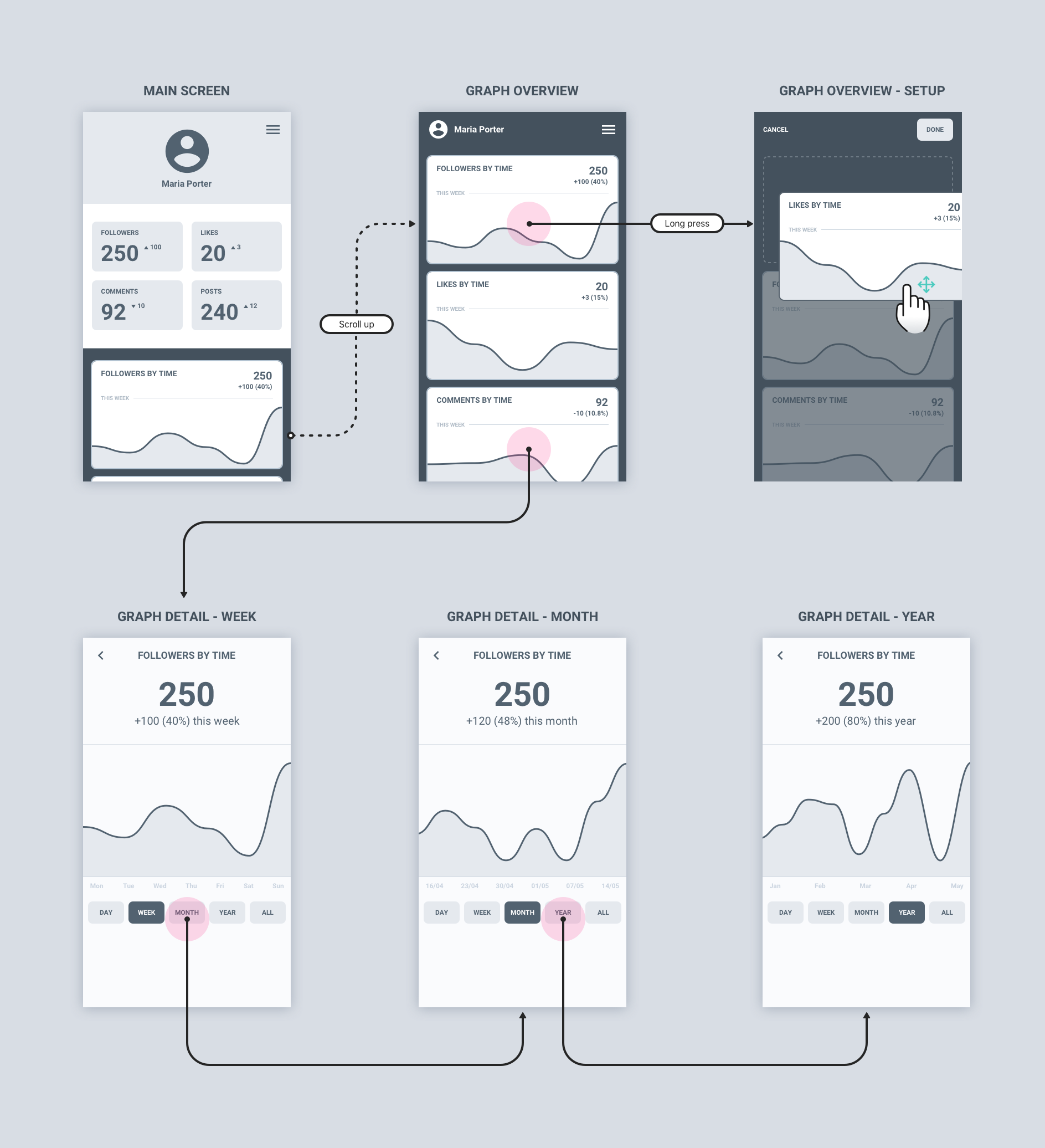
Wireframes are useful to represent user flows and make decissions on content. It's also quite easy to build a protoype from these if you use tools like Sketch or Figma. From there, you can test how close a design solution is from the problem you're trying to solve.
Shaping the MVP
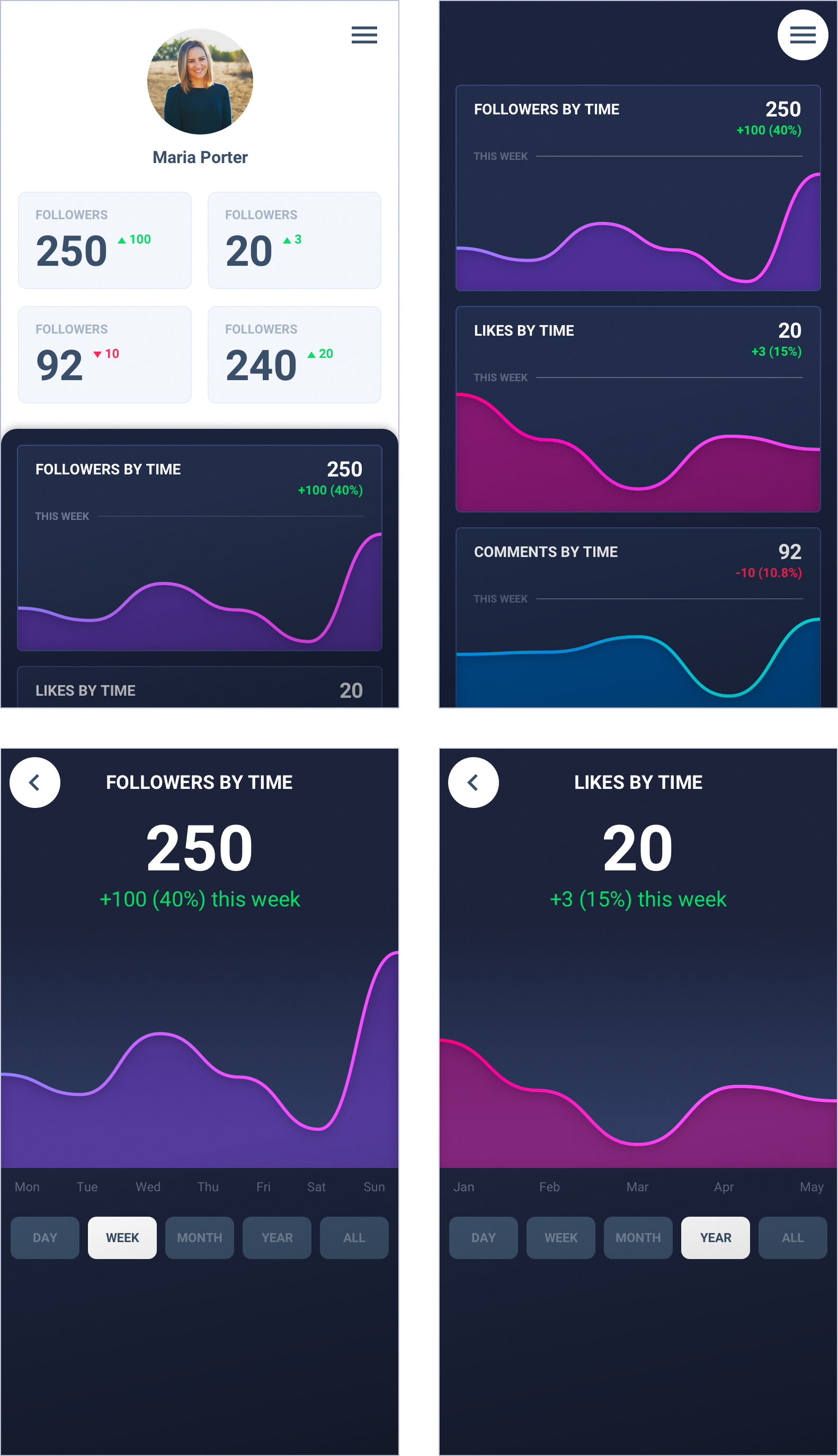
Next step is creating mockups. In this phase is where your design starts to feel like a real product. When you start creating mockups it's important to take into account your company's brand guidelines (if any), things like the visual rythm, the usage of white space, typography. It may also be a good idea to start defining a design language you can use as you move on to ensure your product's visual consistency.
The great thing about mockups is that creating design variations at this stage is still fast. Maybe it's not as as fast as drawing or iterating on wireframes, but it's not very far from that if you choose the right tools. What is also great is that users and stakeholders will perceive mockups as if they were the final product, which is ideal to run user tests to validate or refute your hypotheses.
Final thoughts
Before you start designing you need context. Do your research, try to understand who are you designing for, identify some user pain points, and build a solution to address them. You can use hand-drawn sketches to visually organize ideas fast. If you have an interface designer in your team, use high-fidelity mockups to test with users.
Avoid using wireframes with dummy text to test your designs because most users find it hard to understand. Also, use prototypes to test things like navigation or micro-interactions. Last but not least, don't build prototypes that try to mimic the entire product, as it may take more time than actually building the real thing.