Design exercise by Sergio Vila
Identify the features that need a change and propose solutions in a visual form.
Design brief
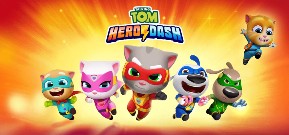
We learned that our characters are one of the main drivers for players as they progress through the worlds. For that reason, we decided it’s time for a new character. Our new character is a baby lion named Mango. We’d like to keep the current system of unlocking characters and would just add another character on top of the existing five. It would be the last to unlock.
Play the game, identify the features that need a change because of the additional character and propose solutions in a visual form.
1. Character discovery
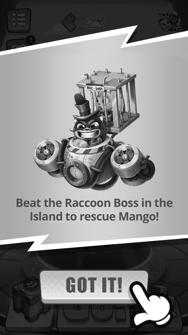
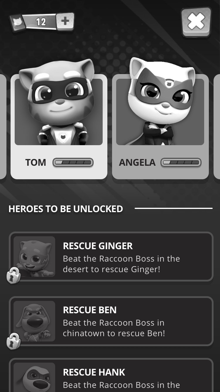
The city has been taken over by a group of rioting raccoons. The game starts with Tom having to chase the evil raccoon boss to save Angela. To be honest, when I started playing the game it took me some time to realize that each character was unlocked when you clean up an entire map (is it just me? Maybe it's something worth exploring). Once you clean a location on the map, there's a fight with the evil racoon boss to save one of Tom's friends. I have to say that this is clearly understood without having to use tutorials and explanations just by playing 20 minutes (great work there!).
In order to introduce the new character, I would keep the opening scene as it is for first-time users but I would add a cutscene for returning users to tell them that the evil raccoon captured Tom's new friend. We could also show the new portion of the map available. When the cutscene ends, we could tell users what happened ("Mango the lion was captured!") before prompting them to continue playing.
Something like this:
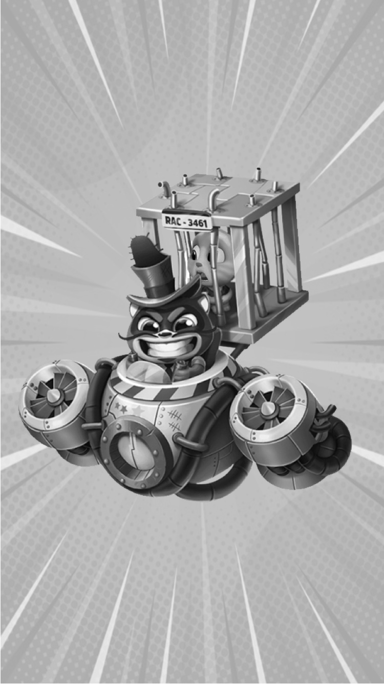
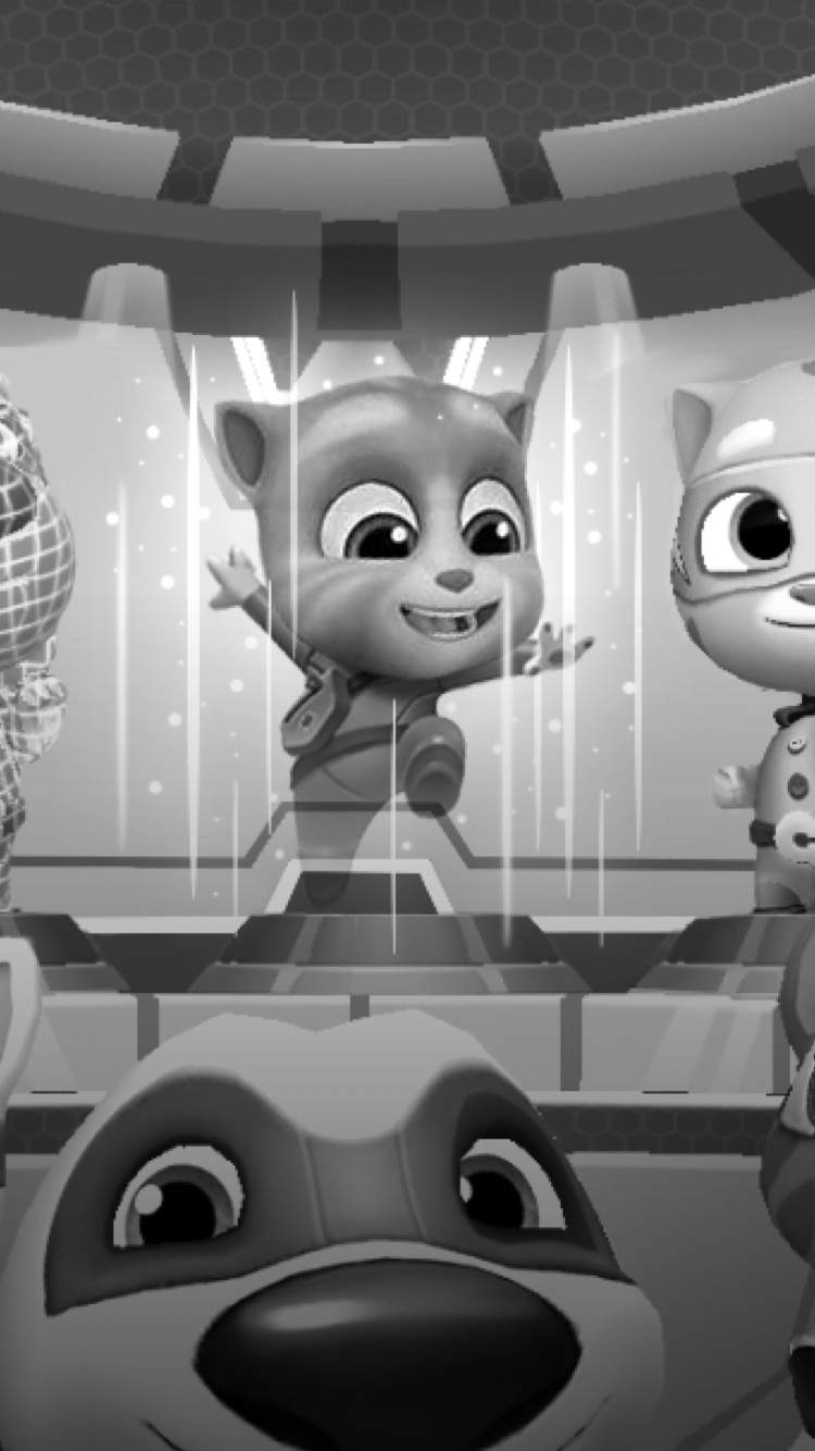
Step 1: After the loading screen, users will see a cutscene of the evil raccoon and his flying machine with Mango trapped in a cage.
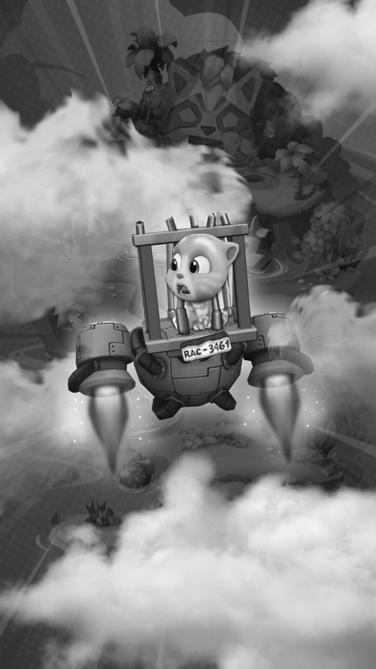
Step 2: The evil raccoon flies away into a new map that is covered with clouds to anticipate that you will have to eventually get there to rescue Mango.
Step 3: The cutscene ends and a new screen will tell users more explicitly that a new world was unlocked and that there's a new character waiting to be saved.
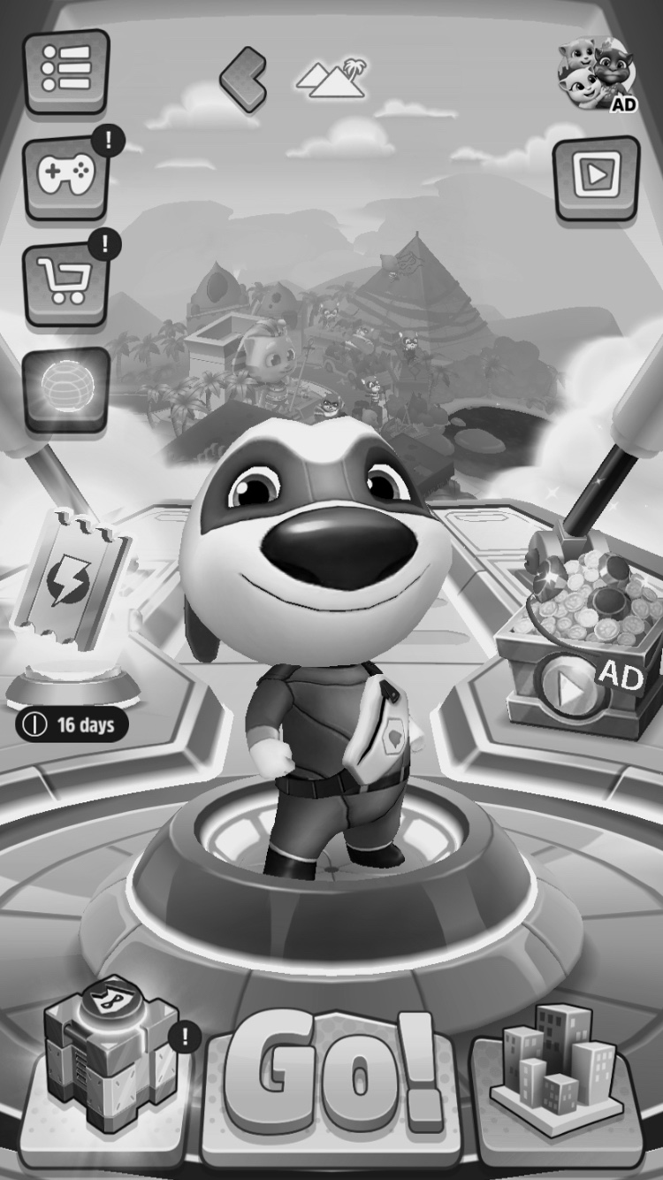
Step 4: Users will get to the main screen. The new character discovery flow will end here and users will be able to start playing normally.
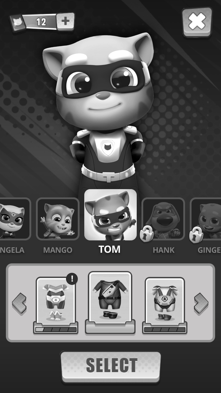
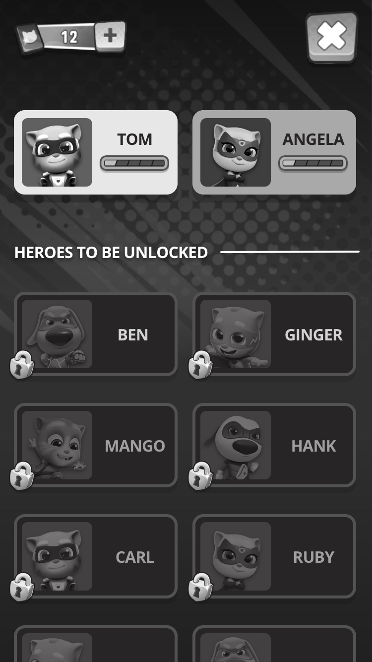
2. Character selection
When users tap on the character on the main screen they go to the character selection screen where they can see locked and unlocked characters. When users access this screen for the first time after the new character has been revealed, I would make him appear with a subtle "beam me up, Scotty" cutscene. Then zoom out to reveal how the new character appears next to the rest of the characters. The goal is to remind users that there's something new here and Mango is waiting to be rescued.
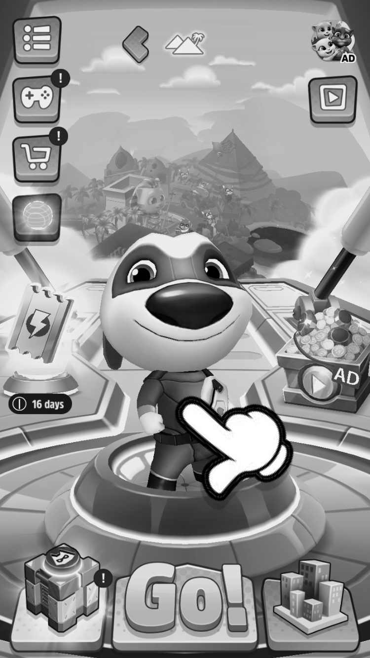
Step 1: When users land on the game's main screen, they will see the currently selected character front and center as usual. Taping the character for the first time will trigger the new character selection flow.
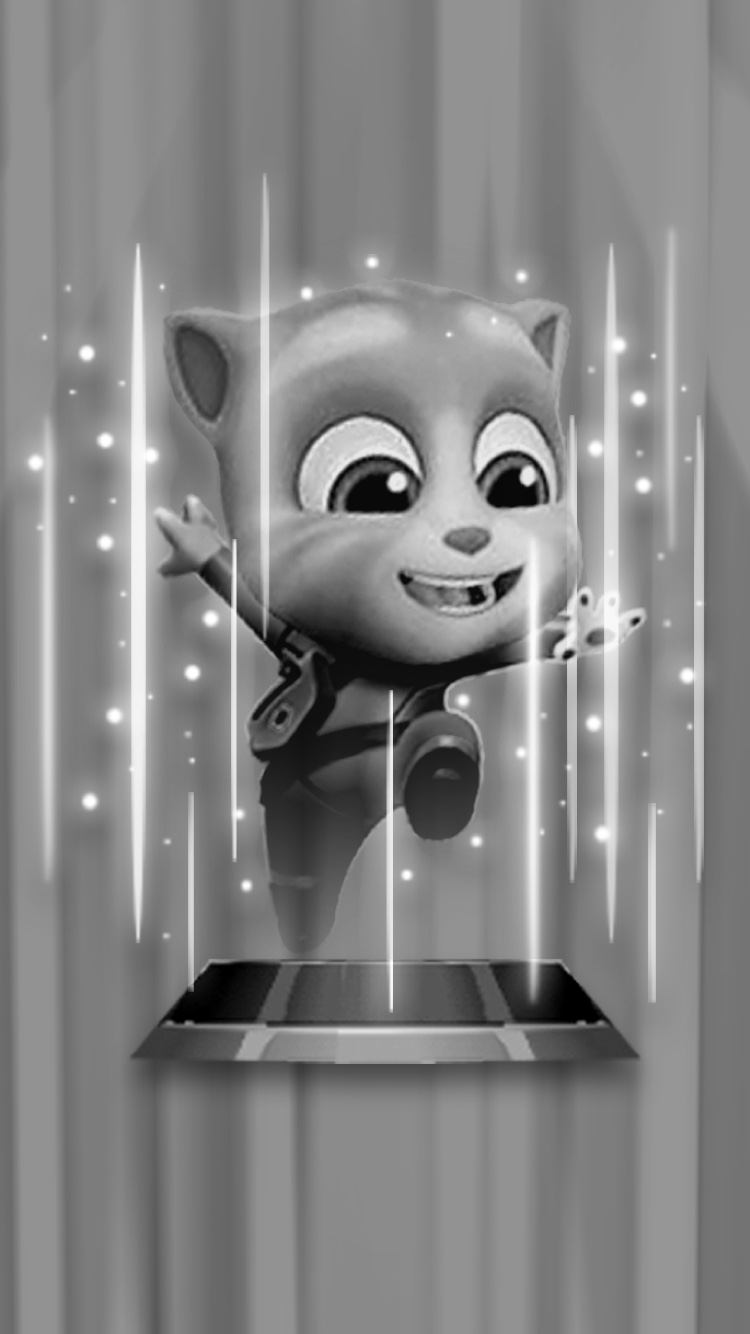
Step 2: After taping the character on the main screen, we could show a cutscene of the new character appearing. The camera will start to zoom out to progressively reveal the character selection screen.
Step 3: The zoom-out will continue and the character selection screen will start to be revealed.
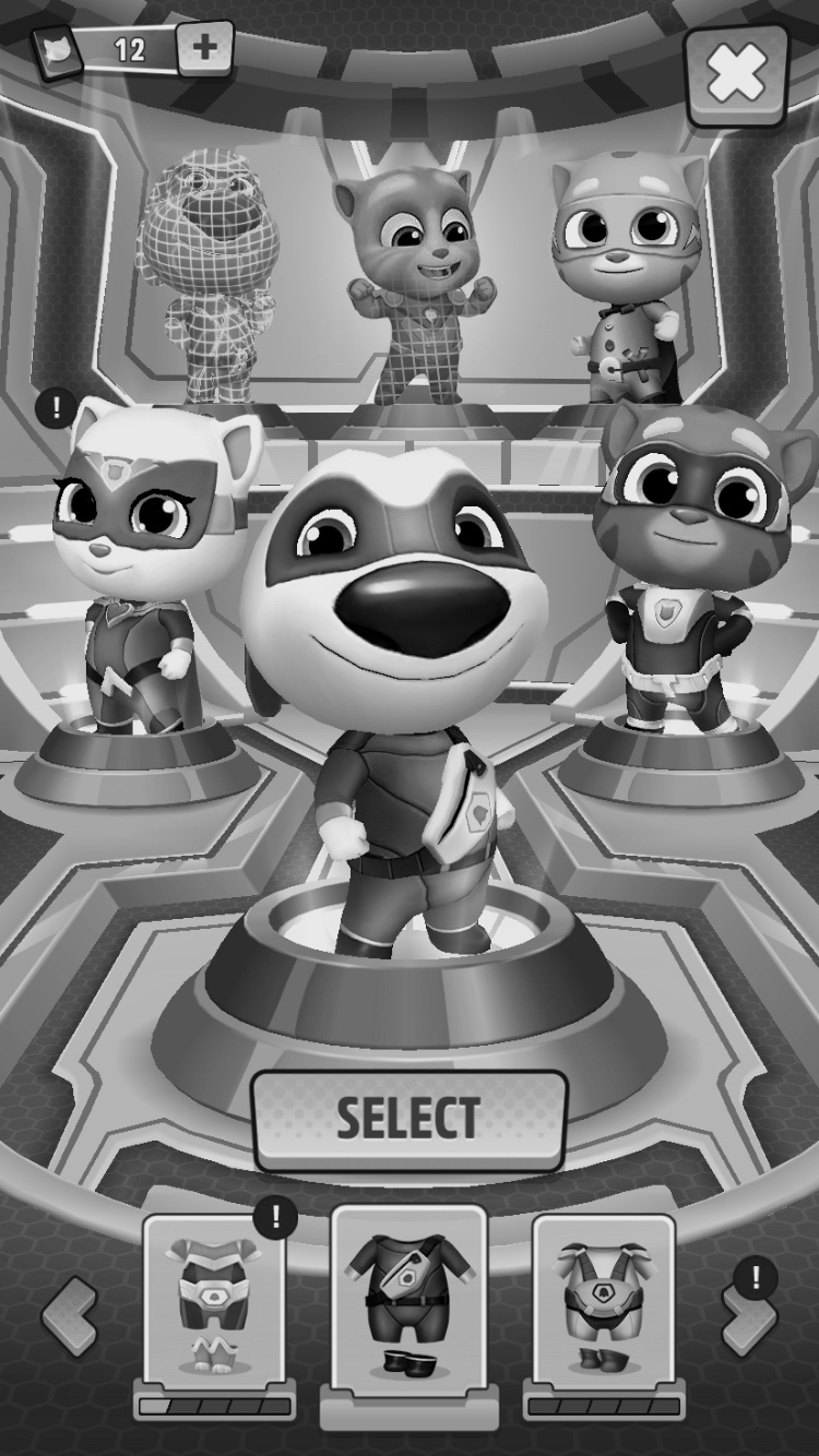
Step 4: Finally, the new character will be positioned in place next to the rest of the characters on the screen.
3. Adding more characters
The design brief states that new characters are one of the main drivers for players to keep on playing and progressing in the game. That makes me think that it would make sense to keep on adding characters and expand the map in the future to keep up user engagement.
In this exercise, I proposed to add one more character without rethinking the structure of the character selection screen. Still, I think that it would make sense to further explore other options that let us better scale the character selection screen.
Option 1: What if we had a carousel with both the locked and unlocked characters. Users would be able to scroll horizontally to choose both, a character and a costume.
Option 2: We could use a bigger version of the carousel with full-sized characters to have more real estate available to showcase them.
Option 3: We could use cards with all the characters and use a vertical scroll. We'd need two screens (a list and a detailed character view), but we could add an infinite amount of characters.
Option 4: We could use a combination of the horizontal and vertical scroll to give more prominence to the unlocked characters and more info on what to do to unlock new ones.
Closing thoughts
There are many ways in which a problem can be solved. What I've described here is one of the possible solutions to add a new character to the game and some of the artefacts I usually create during the process. Being able to explore and test multiple options fast is the secret sauce to deliver micro experiences that stick with users. That's why I think it's better to try and discard frequently than spending too much time with one solution you think is the perfect one.
Feel free to reach out if y'all have any questions.