Design Exercise (Part I) by Sergio Vila
Evaluating the onboarding experience for a free to play mobile game.
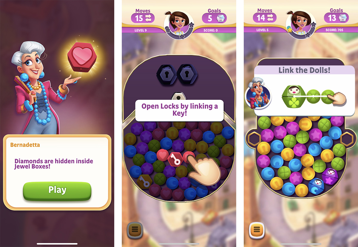
This is the original game trailer. It was not done by me. Still, I think it's great to set up the tone of the product we will be reviewing.
The goal
A heuristic evaluation is a method for finding usability problems in a user interface. It's applied to task-oriented software products where the primary focus is to deliver user interfaces that are easy to use and help facilitate tasks. For video games, the goals include additional concepts like providing an immersive environment, sufficient challenge, and entertainment.
In this exercise, I will follow an informal approach in which I will examine the user interface and some gameplay elements of Diamond Diaries by playing the first 20-30 levels. Based on that I'll judge their compliance with some usability principles from Nielsen and Heuristics for Playability (also known as HEP). Although I'm not going to be exhaustive in the approach and execution of this evaluation, I consider that this will help uncover some game aspects that could be improved based on widely-accepted usability principles.
What is done right?
1. The Information needed is there:
The game shows the minimum required information on the screen to orient you in every moment and the tutorials have essentially no impact on the flow of the game as most of them are part of the gameplay itself. Another great advantage of these contextual tutorials is that they always provide a perfect example of gameplay context surrounding what they are teaching, which helps avoid confusion.
Tutorials are contextual, they are available when you need them, and all of them serve their purpose well.
2. Smart error prevention features:
Undo is supported in a very intuitive way and the game gives you the possibility of recovering fast from unwanted moves. For example, when you start linking charms it's possible to completely cancel that combination by moving your finger away from it. Although this is not explicitly explained in a tutorial until level 10, it's intuitively understood from the beginning.
Another great feature that not only prevents errors but also contributes to making you feel in control is having the possibility of previewing charm combinations. Especially when those combinations trigger chain reactions. You can start creating a combination and automatically see what will happen when you release your finger which is great to plan your next move.
The game seems to have a way to favor viable combinations of 3 or more charms. This is a great way to prevent the annoyance of having to continuously cancel non-viable combinations that are sitting next to the ones that can be completed. This feature makes the game feel faster and contributes to making you feel smart and efficient.
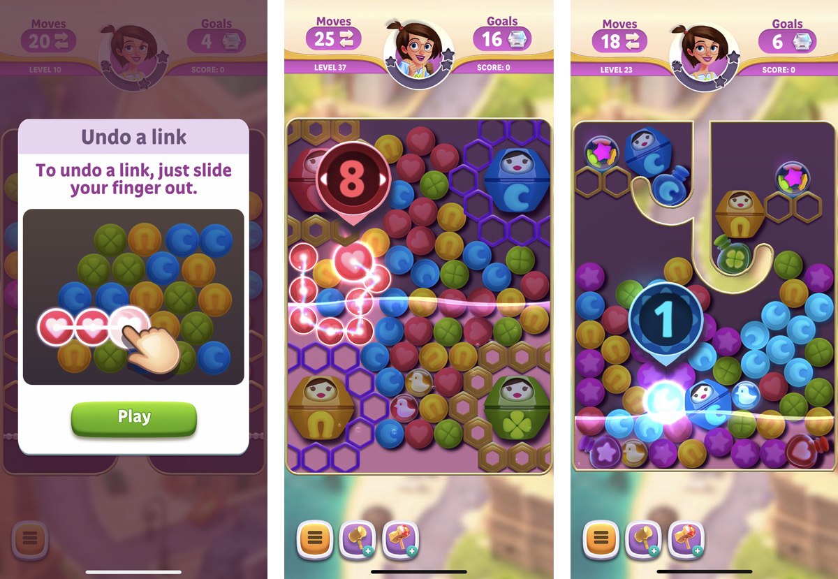
Error prevention features are important to reduce the frustration of performing unwanted actions. In Diamond Diaries, you can undo combinations in a very intuitive way and preview the result of a combination before accepting it.
3. The gameplay keeps your interest:
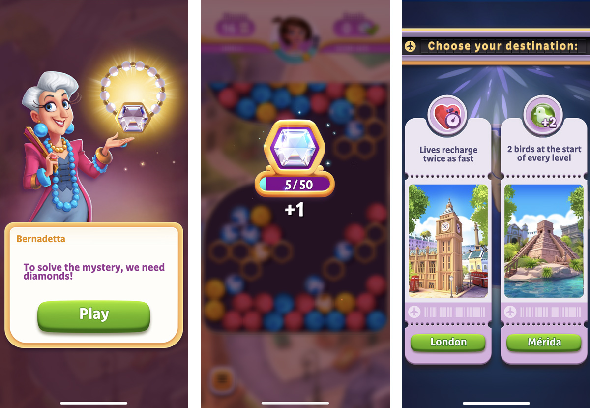
Short-term goals (link charms to collect diamonds and beat levels to progress on the map) and long-term goals (collect enough diamonds to unlock "mysteries") are presented early enough and both of them are clear and easy to understand.
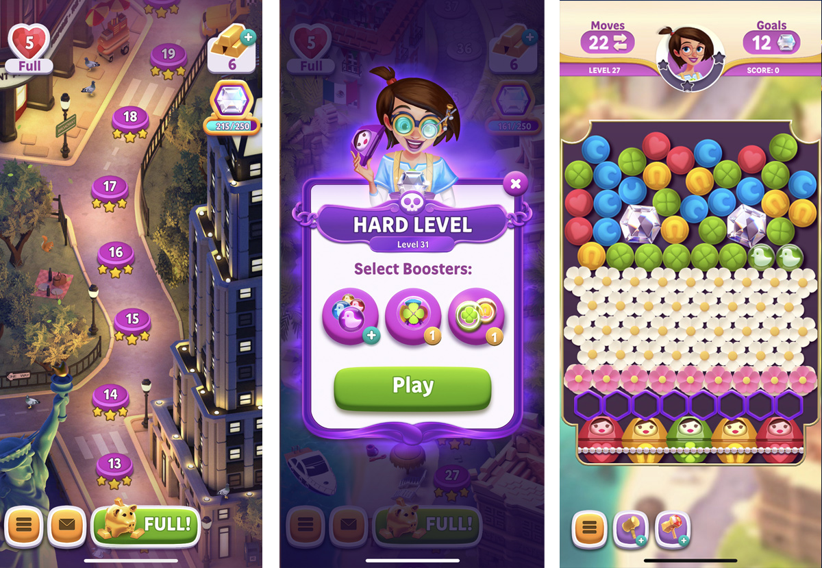
New features are presented progressively and you have the time to get used to them without feeling overwhelmed. Some of them are related to the story, like in-game boosters, and contribute to keeping a sense of immersion. Some others, like high scores, pre-game boosters, or the piggy bank feel more disconnected from the game. In the specific case of high scores, they appear all of a sudden and it's difficult to know what's their purpose in the game (apart from comparing your score with other people). Who are those opponents? Are they real people? Is it a world ranking? players need to understand the purpose of what they do, otherwise, it's easy that they stop paying attention to that feature after several rounds.
Traveling around the world and unlocking new cities makes the game more interesting than just advancing to a random new map. Having the option to choose the city you want to travel makes it even more engaging and can help create an emotional connection with players. They can choose cities that exist in real life and which they may even have visited or want to visit.
Short and long-term goals are clear and easy to understand. Also, the game offers more options as you progress and the pace at which new features are presented makes it easy to get used to them before a new one is presented.
4. The UI is easy to understand:
Overall, the user interface is very polished and beautiful, but most importantly it has a clear structure and you rarely have the feeling that it interferes with gameplay. It's also important to highlight that the UI is easy to learn (if you are new to the game, it's easy to figure out what you are allowed to do and what information is available to you) and easy to use (If you already know what you want to do, performing the desired task correctly is fast and easy).
The discoverability of UI elements is high and it's quite clear what icon buttons do even though there are no text to labels next to them. Standard buttons and main call to actions have a correct size and action areas are separated enough so it's not likely that interactions result in accidental taps. The visual treatment of buttons and other action triggers are consistent across the game and their beveled 3D aspect provides enough explicit affordance to easily identify them as interactive.
The user interface is intuitive and the iconography is clear. Buttons and other interactive elements have the right size and enough distance between them to avoid accidental taps.
What could be done better?
1. Use of progressive disclosure:
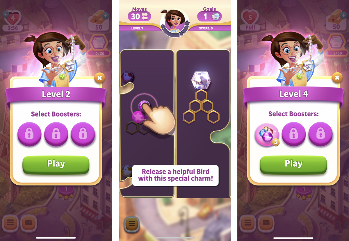
If we take a closer look at the "save your progress" feature we could agree it's presented too early. When you play the game for the first time the last thing you might think about is saving your progress (because you don't have any progress to save). Most likely, the action you will want to perform right after downloading and opening the game is to start playing. Taking into account this and the fact that humans have limited capacity for processing information, it would be better to ask players to save their progress at a later stage. Ideally, once they've been playing for a while. This would help prioritize their attention and let them spend time only on features that are most likely to be useful at the moment they are presented.
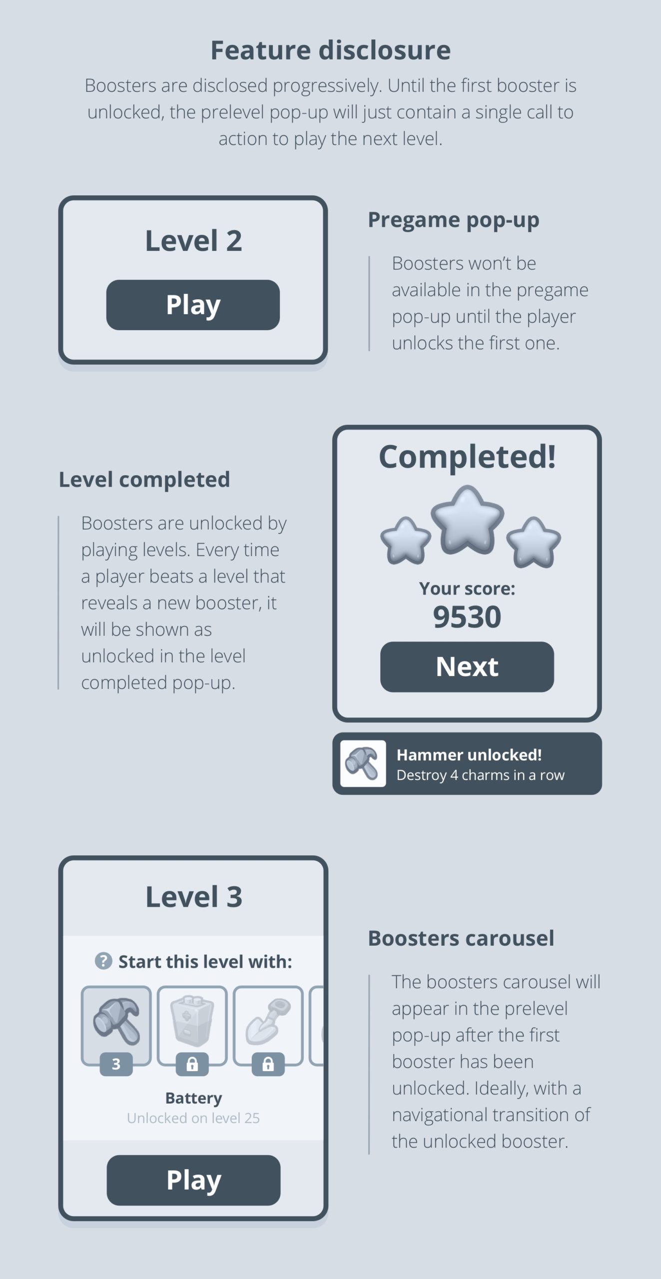
Another feature that could benefit from the progressive disclosure pattern is boosters. Right now you can see a pop-up from the very first level asking you to "select boosters" but you can't select anything because boosters are not unlocked until level 3. On top of that, even when the game explains what a booster does when it’s unlocked, it's difficult to recognize if it's the same thing. This is because they have different names: special charm in one place and booster in the other.
Boosters are shown for the first time when you can't do anything with them. It's usually better to present new functionalities when players can do something with them.
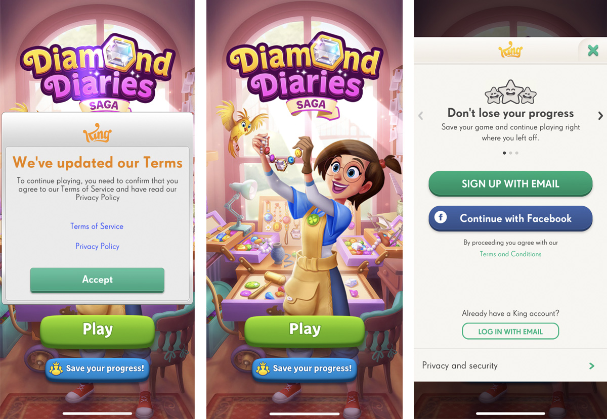
The "save your progress" feature could benefit from being shown when there's some progress you can save. Also, the first time you play you're asked to accept terms and conditions and the UI shows a lot of buttons screaming for your attention.
2. Provide clearer information:
Every extra unit of information in a dialog competes with other relevant units of information and that's why we should be very careful about what and when the game communicates to players.
One example of this is the piggy bank:
First, a pop-up is automatically triggered telling you to win stars in order to earn extra gold bars. Here, we are assuming that players will remember that the stars the game is talking about are the ones they win when passing a level. When I tap the "Awesome!" button, the pop-up closes. The microcopy on this button is not describing the action that will happen when the player taps on it.
If I decide to continue the path the game is presenting me and I tap on the play button, I'll go to the next level. Once I pass the level, I see the same piggy bank next to the stars. Now it's clearer that the stars I won on that level are converted into gold bars because I can see them jumping inside the piggy bank (such a smart use of animation). Still, if I try to tap on the piggy, nothing happens.
When I go back to the map my avatar moves and the pop-up presenting the next level appears. You can follow this flow for a while and it's not until you manually close the prelevel pop-up that you can see there's a new button on the map with a piggy bank icon (good use of iconography here). When I tap on that button, a new pop-up appears with slightly different info than the one I saw in the pop-up presenting this feature: "play levels and win stars to save Gold Bars". Ok, now the star thing is a little bit clearer because I saw that the stars were converted into gold bars at the end of each level. However, the game is telling me now that I will "save" gold bars, not earn them as they told me before. What does "save" mean in this context? Why do I have to pay to get my savings? In any case, even if I want to pay, I can't do anything here because the button is disabled (until I "save" at least 30 gold bars in the piggy bank).
I understand that the intention of the current design for the piggy bank is to anticipate the feature so players get used to seeing it and understand how it works before paying. I'm not going to elaborate here how easy/difficult is to compare gold bar prices with the ones offered in the store (there's no info of the piggy bank there) or having the possibility to break the piggy bank when you actually need it (for example, when you run out of moves and you don't have gold bars), but something that would be worth exploring is the order in which the feature is presented and how we explain it to players.
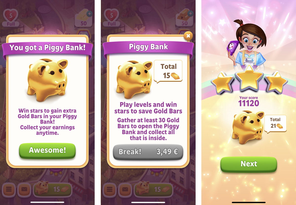
The dialogs of the piggy bank are a little bit confusing and they tell you the same thing in slightly different ways. The usage of animation and iconography is smart, but this feature could benefit from being presented in a different order.
3. The UI could be more consistent:
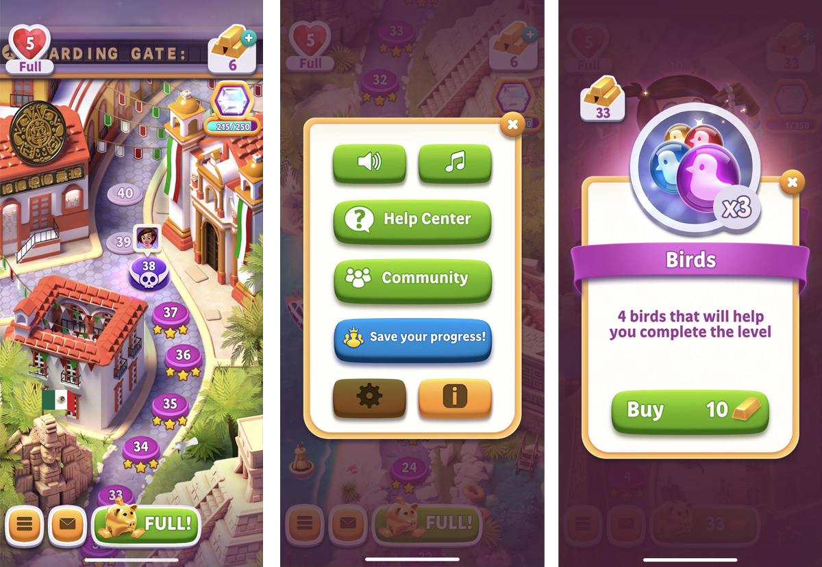
In previous sections of this exercise, I said that the UI is clear and easy to understand, but there are some small issues that could be easily fixed to make it more predictable. First of all, there are false affordances that could lead players to a different result to the one which they expect. For example, the icon buttons on the map look visually consistent but if you tap on the diamond nothing happens and the lives icon is not interactive when it's full. The same thing happens with other buttons and graphic elements across the game (the gold bars icon when you fail a level, the piggy bank at the end of a level, your avatar on the map, etc). I'd recommend running some users through the game and observing what they expect to be interactive and, most importantly, why.
Buttons have a consistent look and the same rounded corner curve, which is great and makes it easier to identify them as buttons, but some of them have animated press states, some have just a pale overlay press state, some react to being tapped with a visual bounce, some don’t. This is a small thing, but keeping actions consistent helps reduce short-term memory load.
The settings menu is opened through the yellow button with the 3 lines icon in the bottom left corner of the map screen. That's what I usually refer to as a "mystery button": you don't know what will happen when you tap on it. If you finally decide to do it, you see that a pop-up with the settings opens. I don’t see why the yellow buttons in the bottom of the pop-up are not actually tabs for switching between pages. Finally, every single one of the buttons has a big bounce upon opening the pop-up. I do understand that this highlights the interactive elements but looks odd.
The UI is clear and easy to understand but there are some false affordances that could lead players to confusion. Also, having more consistency in buttons' behavior and the layout could help increase predictability.
How can it be improved?
In this exercise, I've tried to identify the things that are done great and some others that could be done better, but I have to say that overall the game is intuitive, user-friendly, and enjoyable. You can tell it's very much focused on usability and there's a lot of care to provide an easy game to get into. The designers managed to put the gameplay at the center of the experience, and the use of psychological and design patterns like choice, anticipation, progressive disclosure, or error prevention, is done in a very smart way.
There's always room for improvement and although I already gave some suggestions on how we could improve the onboarding experience of Diamond Diaries Saga, here are some more.
1. Minimize memory load:
Players shouldn't have to remember information from one part of the game to another. For example, part of the monetization strategy relies on boosters and we should find ways to explain them better, present them to players when they can start doing something with them, and remind them how they are used in context. Besides that, offering contextual tutorials is great, but we should make it possible for players to also retrieve help when they need it or when they feel stuck.
2. Use navigational transitions:
We could make better use of animations to help players see where a new object comes from and where it goes because often state changes in the game involve hard cuts, making them difficult to follow. For example, by using navigational transitions we could make it easier for players to understand when a new feature is unblocked in one place but it's supposed to be used in a different one. Explaining these changes by creating visual connections could be far more effective than using a hard cut and showing a tutorial.
3. Associate visible and hidden UI:
When players open a pop-up, we could animate their launch from the triggering button (i.e. scale up the piggy bank pop-up from the piggy bank button, and scale down the piggy bank pop-up back to the piggy bank button upon closing). This way players will associate the pop-ups with their initiators better and make more sense of where they should go to trigger them again.
4. Inspire players to progress:
Allowing players to easily keep track of their progress is a great way of keeping them engaged. Tracking progression on the saga map is great to accomplish this, but I miss having more ways of visually encouraging players in the context of the goals and rules of the game. We could provide different visual forms like progress bars, levels, encouragement messages, or animations when goals are completed. Reinforcing and providing more visual feedback about progression could be a great way to improve engagement.
Design Exercise (Part I) by Sergio Vila
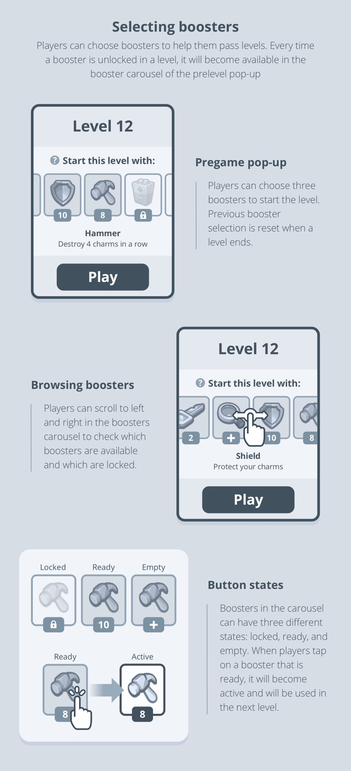
How would players equip 3 types of boosters if the game had 20 or more?
Before starting this exercise, I analyzed the current design and I soon realized it was going to be difficult to design a solution that can scale to fit 20 different types of boosters without radically changing the layout of the view. I first considered using a different interaction model like dragging items, but it can harm the game experience if it’s not done right. I was also concerned about radically changing the placement and behavior of boosters as this is quite an established pattern across F2P games.
The most important action on this screen is "Play" and I didn't want to add any other actions that could interfere. Boosters are important, but they are helpers. We need to encourage players to use them but it's not something they are supposed to interact with if they don't want to.
If we don't want to radically change the view, add more action buttons, or change the interaction model, the only way to introduce more elements was by using a scroll. A vertical scroll was rapidly discarded because I wanted to keep the header and the "Play" button in place, and that's why I decided to start experimenting with a horizontal scroll.
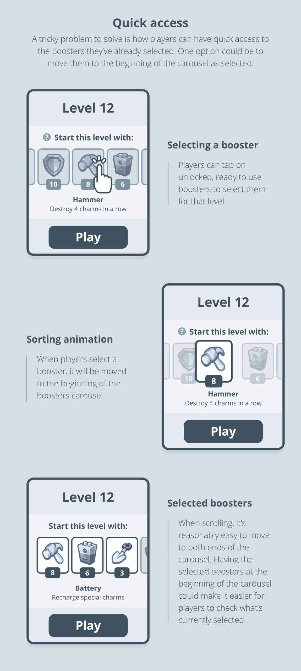
I think the solution I'm proposing here keeps most of the benefits of the original one and adds an extra layer of information, a better way of discovering recently unlocked boosters, and a natural way of scrolling and selecting them. That said, there are some aspects of this proposal that would require further thinking and exploration. Also, it would be interesting to test the proposed navigational and functional animations through interactive prototypes.